
Test Adapter lovelace v0.2.x

-
@WW1983 sagte in Test Adapter lovelace v0.2.x:
Hat jemand die Wetter-Card zum laufen gebracht? Bei mir werden keine Icons angezeigt. Das war aber nicht immer so.
Hier das gleiche, hast du eine Lösung gefunden?
-
@WW1983 Ich habe den Code kopiert, jedoch ändert sich nicht am Theme.
# Main colors primary-color: '#5294E2' # Header accent-color: '#E45E65' # Accent color dark-primary-color: 'var(--accent-color)' # Hyperlinks light-primary-color: 'var(--accent-color)' # Horizontal line in about ha-card-border-radius: '20px' ha-card-background: 'rgba(150, 150, 150, 0.1)' # Text colors primary-text-color: '#FFFFFF' # Primary text colour, here is referencing dark-primary-color text-primary-color: 'var(--primary-text-color)' # Primary text colour secondary-text-color: '#5294E2' # For secondary titles in more info boxes etc. disabled-text-color: '#7F848E' # Disabled text colour label-badge-border-color: 'green' # Label badge border, just a reference value # Background colors primary-background-color: '#383C45' # Settings background secondary-background-color: '#383C45' # Main card UI background divider-color: 'rgba(0, 0, 0, .12)' # Divider # Table rows table-row-background-color: '#353840' # Table row table-row-alternative-background-color: '#3E424B' # Table row alternative # Nav Menu paper-listbox-color: 'var(--primary-color)' # Navigation menu selection hoover paper-listbox-background-color: '#2E333A' # Navigation menu background paper-grey-50: 'var(--primary-text-color)' paper-grey-200: '#414A59' # Navigation menu selection # Paper card paper-card-header-color: 'var(--accent-color)' # Card header text colour paper-card-background-color: 'rgba(150, 150, 150, 0.1)' # Card background colour paper-dialog-background-color: '#434954' # Card dialog background colour paper-item-icon-color: 'var(--primary-text-color)' # Icon color paper-item-icon-active-color: '#F9C536' # Icon color active paper-item-icon_-_color: 'green' paper-item-selected_-_background-color: '#434954' # Popup item select paper-tabs-selection-bar-color: 'green' # Labels label-badge-red: 'var(--accent-color)' # References the brand colour label badge border label-badge-text-color: 'var(--primary-text-color)' # Now same as label badge border but that's a matter of taste label-badge-background-color: '#2E333A' # Same, but can also be set to transparent here label-badge-background: 'rgba(255, 255, 255, 0.1)' # Switches paper-toggle-button-checked-button-color: 'var(--accent-color)' paper-toggle-button-checked-bar-color: 'var(--accent-color)' paper-toggle-button-checked-ink-color: 'var(--accent-color)' paper-toggle-button-unchecked-button-color: 'var(--disabled-text-color)' paper-toggle-button-unchecked-bar-color: 'var(--disabled-text-color)' paper-toggle-button-unchecked-ink-color: 'var(--disabled-text-color)' # Sliders paper-slider-knob-color: 'var(--accent-color)' paper-slider-knob-start-color: 'var(--accent-color)' paper-slider-pin-color: 'var(--accent-color)' paper-slider-active-color: 'var(--accent-color)' paper-slider-container-color: 'linear-gradient(var(--primary-background-color), var(--secondary-background-color)) no-repeat' paper-slider-secondary-color: 'var(--secondary-background-color)' paper-slider-disabled-active-color: 'var(--disabled-text-color)' paper-slider-disabled-secondary-color: 'var(--disabled-text-color)' # Google colors google-red-500: '#E45E65' google-green-500: '#39E949' -
-
@WW1983 hast du es hinbekommen den header transparent zu bekommen mit der compact-custom-header card ?
-
@WW1983
Ich habe alles mögliche versucht aber die Card hat nicht funktioniert.
Ich habe es auch nur dunkler gemacht -
@marcuskl
es funktionieren derzeit so einige Cards nicht. Ich hoffe das wird irgendwann noch behoben.Man kann zwar jetzt schon was brauchbares basteln. Aber schade das noch so vieles nicht funktioniert. Auch die "Standard-Entitys"
-
@WW1983 Ja des stimmt.
Ich würde gerne mal meine RGB Beleuchtungen einbinden, aber die light entiy card funktioniert auch noch nicht.
https://github.com/ljmerza/light-entity-card -
Hat bei mir auch nicht so funktioniert.
Du musst vorher "transparent:" hinzufügen, so:transparent: # Main colors primary-color: '#5294E2' # Header accent-color: '#E45E65' # Accent color dark-primary-color: 'var(--accent-color)' # Hyperlinks ........dann funktioniert es.
Ich habe noch das Hintergrund Bild bei den Cards hochgeladen und die Zeile Backround image hinzugefügt.
#Background images background: center / cover no-repeat url("/cards/background.jpg") fixed@marcuskl danke
transparent: # Main colors primary-color: '#5294E2' # Header accent-color: '#E45E65' # Accent color dark-primary-color: 'var(--accent-color)' # Hyperlinks light-primary-color: 'var(--accent-color)' # Horizontal line in about ha-card-border-radius: '20px' ha-card-background: 'rgba(150, 150, 150, 0.1)' # Text colors primary-text-color: '#FFFFFF' # Primary text colour, here is referencing dark-primary-color text-primary-color: 'var(--primary-text-color)' # Primary text colour secondary-text-color: '#5294E2' # For secondary titles in more info boxes etc. disabled-text-color: '#7F848E' # Disabled text colour label-badge-border-color: 'green' # Label badge border, just a reference value # Background colors primary-background-color: '#383C45' # Settings background secondary-background-color: '#383C45' # Main card UI background divider-color: 'rgba(0, 0, 0, .12)' # Divider # Table rows table-row-background-color: '#353840' # Table row table-row-alternative-background-color: '#3E424B' # Table row alternative # Nav Menu paper-listbox-color: 'var(--primary-color)' # Navigation menu selection hoover paper-listbox-background-color: '#2E333A' # Navigation menu background paper-grey-50: 'var(--primary-text-color)' paper-grey-200: '#414A59' # Navigation menu selection # Paper card paper-card-header-color: 'var(--accent-color)' # Card header text colour paper-card-background-color: 'rgba(150, 150, 150, 0.1)' # Card background colour paper-dialog-background-color: '#434954' # Card dialog background colour paper-item-icon-color: 'var(--primary-text-color)' # Icon color paper-item-icon-active-color: '#F9C536' # Icon color active paper-item-icon_-_color: 'green' paper-item-selected_-_background-color: '#434954' # Popup item select paper-tabs-selection-bar-color: 'green' # Labels label-badge-red: 'var(--accent-color)' # References the brand colour label badge border label-badge-text-color: 'var(--primary-text-color)' # Now same as label badge border but that's a matter of taste label-badge-background-color: '#2E333A' # Same, but can also be set to transparent here label-badge-background: 'rgba(255, 255, 255, 0.1)' # Switches paper-toggle-button-checked-button-color: 'var(--accent-color)' paper-toggle-button-checked-bar-color: 'var(--accent-color)' paper-toggle-button-checked-ink-color: 'var(--accent-color)' paper-toggle-button-unchecked-button-color: 'var(--disabled-text-color)' paper-toggle-button-unchecked-bar-color: 'var(--disabled-text-color)' paper-toggle-button-unchecked-ink-color: 'var(--disabled-text-color)' # Sliders paper-slider-knob-color: 'var(--accent-color)' paper-slider-knob-start-color: 'var(--accent-color)' paper-slider-pin-color: 'var(--accent-color)' paper-slider-active-color: 'var(--accent-color)' paper-slider-container-color: 'linear-gradient(var(--primary-background-color), var(--secondary-background-color)) no-repeat' paper-slider-secondary-color: 'var(--secondary-background-color)' paper-slider-disabled-active-color: 'var(--disabled-text-color)' paper-slider-disabled-secondary-color: 'var(--disabled-text-color)' # Google colors google-red-500: '#E45E65' google-green-500: '#39E949' # Background images background: center / cover no-repeat url("/cards/background.jpg") fixed -
Hi,
mal was zum Einstieg ehe ich mich tief darin verliere ;). Sollte man ebenfalls pro verschiedene Auflösung (z.B. Tablet & Smartphone) am besten 2 Views erstellen oder kann man das out of the box mit einer View bewerkstelligen.
Ansonsten klingt der Adapter sehr interessant und ich bin schon fleißig am rumprobieren. Guter Ansatz bzw. Umsetzung.
vg
Falk -
@Scrounger sagte in Test Adapter lovelace v0.2.x:
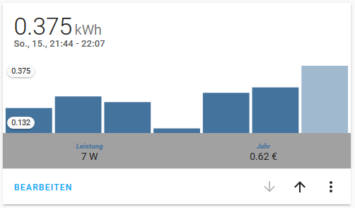
Hier mal ein paar Beispiele, was ich so mit lovelace realisiert habe.
Hauptsächlich verwende ich die button-card, da diese sehr viel Flexibilität ermöglicht und man so mit manuellen entities sehr gut arbeiten kann.
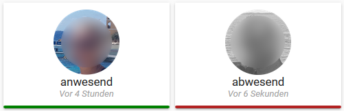
Anwesenheit
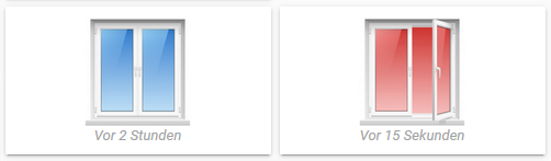
Fenster
Licht - Schalter
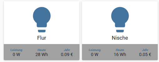
Licht - Dimmer
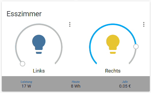
Geräte
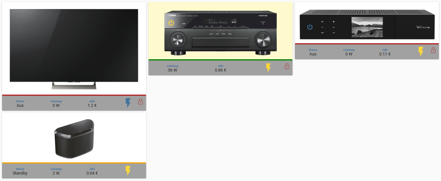
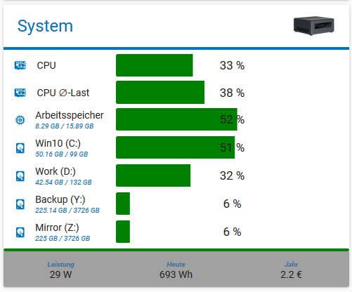
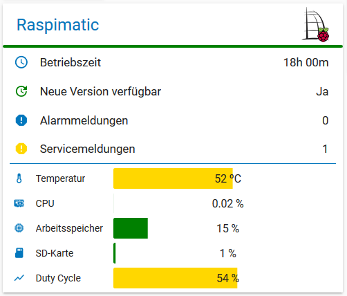
Bar-Chart
tolle arbeit, wie hast u das mit den Pictures gelöst. Wie lautet der Pfad im Iobroker?
Gruß -
@g-polat
Glaub node-modules/lovelace/hass-irgendwa/static/
Bin Grad nicht am Rechner.Und da dann reinkopiert. Achtung nach Adapter Update sind die Bilder dann weg!
Könnte man den Ordner theoretisch mit Schreibschutz versehen, oder gibt dann ein Problem mit dem Update?
-
Bei mir passt noch alles nach dem Update.
Habe aber immer noch das Problem, dass die Bedienung sehr sehr träge ist. Gerade wenn das Display vom Tablet längere Zeit aus gewesen. Energiesparmodus für Fully habe ich deaktiviert. Die Motiton Detection dagegen funktioniert super.
Muss ich irgendwo noch etwas einstellen? Sonst keiner dieser Problem?
@BobBruni said in Test Adapter lovelace v0.2.x:
Habe aber immer noch das Problem, dass die Bedienung sehr sehr träge ist. Gerade wenn das Display vom Tablet längere Zeit aus gewesen. Energiesparmodus für Fully habe ich deaktiviert. Die Motiton Detection dagegen funktioniert super.
Dieses Problem hat sich zum Glück nach einer kompletten Neuinstallation von ioBroker auf neuer Hardware (RPI4) erledigt.
Allerdings habe ich nun das Problem, dass nach einer gewissen Zeit (ich schätze ca. 24h), die Zustände meiner Objekte nicht mehr aktuell sind. z.B. eine Lampe deren Zustand noch als True angezeigt wird, obwohl in ioBroker auf False.
In diesem Fall hilft nur ein Neustart von Lovlace. Anschließend läuft wieder alles synchron... Für eine gewisse Zeit :(Jemand ne Idee?
-
Mein Lovelace Adapter startet seit kurzen immer wieder neu?
lovelace.0 2019-11-01 14:08:04.661 info (2780) starting. Version 0.2.3 in /opt/iobroker/node_modules/iobroker.lovelace, node: v10.16.3 host.iobroker 2019-11-01 14:08:01.552 info instance system.adapter.lovelace.0 started with pid 2780 host.iobroker 2019-11-01 14:08:00.537 info Restart adapter system.adapter.lovelace.0 because enabled host.iobroker 2019-11-01 14:08:00.536 error instance system.adapter.lovelace.0 terminated with code 156 (156) lovelace.0 2019-11-01 14:08:00.516 info (2752) terminating lovelace.0 2019-11-01 14:08:00.017 info (2752) Terminated (START_IMMEDIATELY_AFTER_STOP): Without reason lovelace.0 2019-11-01 14:08:00.016 info (2752) terminating lovelace.0 2019-11-01 14:08:00.008 info (2752) cleaned everything up... lovelace.0 2019-11-01 14:08:00.006 info (2752) Scheduled restart. lovelace.0 2019-11-01 14:07:05.583 warn (2752) no max value for light object 'shelly.0.SHRGBW2#5A38A7#1.color' defined -> using fallback max = 100 lovelace.0 2019-11-01 14:07:04.947 info (2752) http server listening on port 8091 lovelace.0 2019-11-01 14:07:04.805 info (2752) starting. Version 0.2.3 in /opt/iobroker/node_modules/iobroker.lovelace, node: v10.16.3 host.iobroker 2019-11-01 14:07:01.552 info instance system.adapter.lovelace.0 started with pid 2752 host.iobroker 2019-11-01 14:07:00.537 info Restart adapter system.adapter.lovelace.0 because enabled host.iobroker 2019-11-01 14:07:00.536 error instance system.adapter.lovelace.0 terminated with code 156 (156) -
Da steht scheduled restart ... den hast du eingestellt. Korrekt? Cron Regel korrekt?
Beitrag hat geholfen? Votet rechts unten im Beitrag :-) https://paypal.me/Apollon77 / https://github.com/sponsors/Apollon77
- Debug-Log für Instanz einschalten? Admin -> Instanzen -> Expertenmodus -> Instanz aufklappen - Loglevel ändern
- Logfiles auf Platte /opt/iobroker/log/… nutzen, Admin schneidet Zeilen ab
-
@apollon77 sagte in Test Adapter lovelace v0.2.x:
Da steht scheduled restart ... den hast du eingestellt. Korrekt? Cron Regel korrekt?
Stimmt, hatte den Cronjob falsch eingestellt.
Danke 👍 -
@marcuskl
Habe die auch schon getestet. Bei mir funktioniert die auch nicht. Aber auch die integrierte Light Card funktioniert bei mir nicht. Kann nur licht an und aus machen, aber mit der Card nicht die Dimmfunktion nutzen.@WW1983 said in Test Adapter lovelace v0.2.x:
@marcuskl
Habe die auch schon getestet. Bei mir funktioniert die auch nicht. Aber auch die integrierte Light Card funktioniert bei mir nicht. Kann nur licht an und aus machen, aber mit der Card nicht die Dimmfunktion nutzen.Hallo
schon gefixed bekommen? Habe das selbe Problem -
Hat jemand von euch einen Dim Aktor von Homematic in Lovelace eingebunden?
Ich habe es versucht... Das hier kam dabei raus...
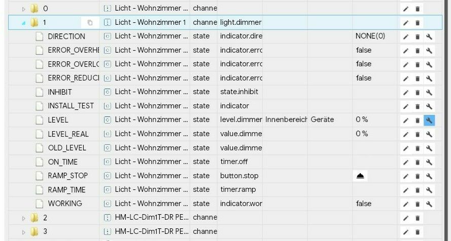
Zur Erklärung:
Ich habe das Objekt LEVEL verwendet. Denn wenn ich das unter ioBroker -> Objekte von hand auf einen Wert von 75% setze, wird das Homematic Modul auch angesteuert.
Zusätzlich habe ich eine Variable für Lovelace von Hand angelegt. Somit liegen auf dem einen Objekt 2 Variablen für Lovelace. Diese sind:- light.Licht___Wohnzimmer_1
- input_number.Licht_Wohnzimmer_1
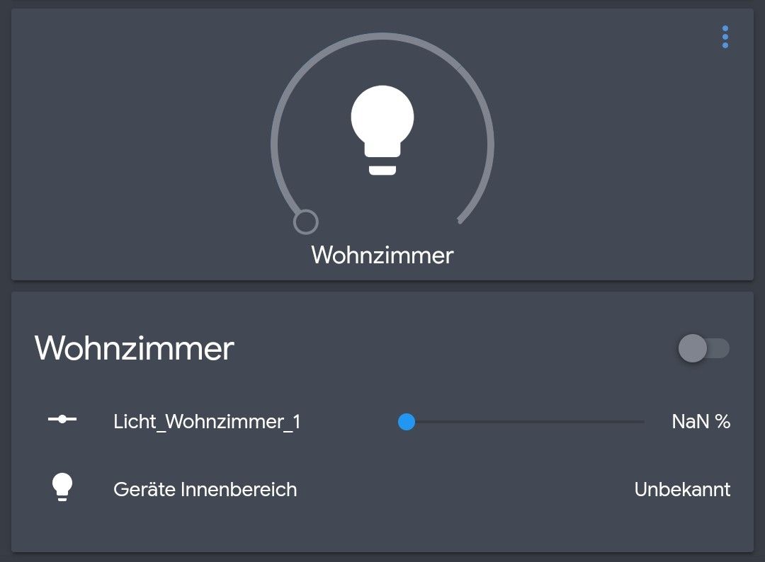
Auf dem 2 Bild sieht man dann, dass ich 2 unterschiedliche Cards hinzugefügt habe. Die Light Cards ist mit light.Licht___Wohnzimmer_1 parametriert und setzt beim Ändern unter Lovelace das Objekt nicht auf den gewünschten Wert. Da passiert überhaupt nichts.
Die andere Card ist eine Entities Card und mit beiden Variablen parametriert. Wie man sieht, wird bei der input_number "NaN %" angezeigt. Ändere ich den Wert über den Slider, so ändert sich der Wert des Objekts, aber in der Card bleibt der Wert auf "NaN %". Und die Variable light lässt sich ja (wie man sieht) nicht bedienen.Ich Stelle mit die Frage, ob ich den Channel nicht für Lovelace angeben muss (anstelle von Objekt LEVEL). Aber vielleicht habt ihr ja einen Tipp für mich. Oder es ist am Ende ein Bug (Kombi aus HM Gerät und Lovelace).
Hey! Du scheinst an dieser Unterhaltung interessiert zu sein, hast aber noch kein Konto.
Hast du es satt, bei jedem Besuch durch die gleichen Beiträge zu scrollen? Wenn du dich für ein Konto anmeldest, kommst du immer genau dorthin zurück, wo du zuvor warst, und kannst dich über neue Antworten benachrichtigen lassen (entweder per E-Mail oder Push-Benachrichtigung). Du kannst auch Lesezeichen speichern und Beiträge positiv bewerten, um anderen Community-Mitgliedern deine Wertschätzung zu zeigen.
Mit deinem Input könnte dieser Beitrag noch besser werden 💗
Registrieren AnmeldenSupport us
218
Online33.0k
Benutzer83.4k
Themen1.3m
Beiträge