
Test Adapter lovelace v0.2.x

-
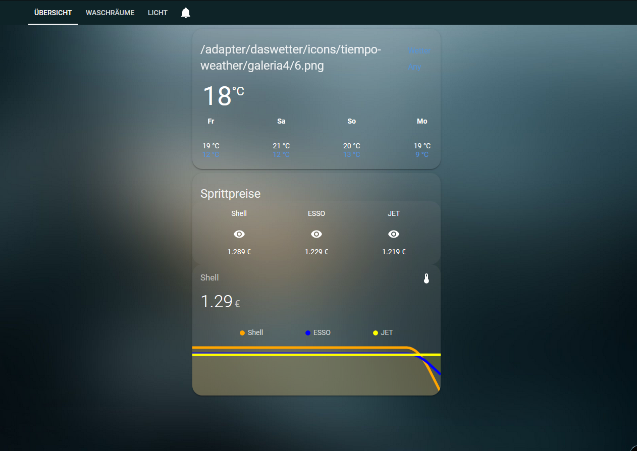
Weiß zufällig jemand in welcher Datei der Link für die Wettericons hinterlegt ist? Bei mir Zeit der keine Icons an:
-
@marcuskl
das ist das Theme. Habe nur den Hintergrund dunkler gemacht:
https://techleech.com/2019/04/11/diy-smart-home-bonus-content-home-assistant-theme/ -
Hat jemand die Wetter-Card zum laufen gebracht? Bei mir werden keine Icons angezeigt. Das war aber nicht immer so.
@WW1983 sagte in Test Adapter lovelace v0.2.x:
Hat jemand die Wetter-Card zum laufen gebracht? Bei mir werden keine Icons angezeigt. Das war aber nicht immer so.
Hast Du die Icon irgendwann mal selbst kopiert/hochgeladen und kann es sein dass dies erst seit der Aktualisierung auf js-controller v2.x so ist?, dann könnte es mit den Hinweisen hier zu tun haben.
Weiterhin wird der ioBroke-Eigene-Dateibereich (im Normalfall bisher unter <ioBroker-Verzeichnis>/iobroker-data/files/...) nun strikter behandelt und manuell oder per Skript (fs.write) dort direkt abgelegte/hinkopierte Dateien sind ggf. nicht mehr in Visualisierungen anzeigbar! Skripte müssen angepasst werden (Nutzung von writeFile) bzw. die Dateien müssen in offiziell definierte Adpater-Basisverzeichnisse (z.B. vis.0, iqontrol.meta u.ä.) abgelegt werden. Nutzt am besten auch die offiziellen Uploader via Vis oder iqontrol, damit diese Dateien korrekt registriert sind. Diese Änderung wurde auch zur Erhöhung der Sicherheit umgesetzt! Der positive Nebeneffekt ist auch das die Files dann mit im Backup landen, was bisher nicht gegeben war! -
@marcuskl
das ist das Theme. Habe nur den Hintergrund dunkler gemacht:
https://techleech.com/2019/04/11/diy-smart-home-bonus-content-home-assistant-theme/@WW1983 Ich habe den Code kopiert, jedoch ändert sich nicht am Theme.
# Main colors
primary-color: '#5294E2'                                                        # Header
accent-color: '#E45E65'                                                         # Accent color
dark-primary-color: 'var(--accent-color)'                                       # Hyperlinks
light-primary-color: 'var(--accent-color)'                                      # Horizontal line in about
ha-card-border-radius: '20px'
ha-card-background: 'rgba(150, 150, 150, 0.1)'

# Text colors
primary-text-color: '#FFFFFF'                                                   # Primary text colour, here is referencing dark-primary-color
text-primary-color: 'var(--primary-text-color)'                                 # Primary text colour
secondary-text-color: '#5294E2'                                                 # For secondary titles in more info boxes etc.
disabled-text-color: '#7F848E'                                                  # Disabled text colour
label-badge-border-color: 'green'                                               # Label badge border, just a reference value

# Background colors
primary-background-color: '#383C45'                                             # Settings background
secondary-background-color: '#383C45'                                           # Main card UI background
divider-color: 'rgba(0, 0, 0, .12)'                                             # Divider

# Table rows
table-row-background-color: '#353840'                                           # Table row
table-row-alternative-background-color: '#3E424B'                               # Table row alternative

# Nav Menu
paper-listbox-color: 'var(--primary-color)'                                     # Navigation menu selection hoover
paper-listbox-background-color: '#2E333A'                                       # Navigation menu background
paper-grey-50: 'var(--primary-text-color)'
paper-grey-200: '#414A59'                                                       # Navigation menu selection

# Paper card
paper-card-header-color: 'var(--accent-color)'                                  # Card header text colour
paper-card-background-color: 'rgba(150, 150, 150, 0.1)'                         # Card background colour
paper-dialog-background-color: '#434954'                                        # Card dialog background colour
paper-item-icon-color: 'var(--primary-text-color)'                              # Icon color
paper-item-icon-active-color: '#F9C536'                                         # Icon color active
paper-item-icon_-_color: 'green'
paper-item-selected_-_background-color: '#434954'                               # Popup item select
paper-tabs-selection-bar-color: 'green'

# Labels
label-badge-red: 'var(--accent-color)'                                          # References the brand colour label badge border
label-badge-text-color: 'var(--primary-text-color)'                             # Now same as label badge border but that's a matter of taste
label-badge-background-color: '#2E333A'                                         # Same, but can also be set to transparent here
label-badge-background: 'rgba(255, 255, 255, 0.1)'

# Switches
paper-toggle-button-checked-button-color: 'var(--accent-color)'
paper-toggle-button-checked-bar-color: 'var(--accent-color)'
paper-toggle-button-checked-ink-color: 'var(--accent-color)'
paper-toggle-button-unchecked-button-color: 'var(--disabled-text-color)'
paper-toggle-button-unchecked-bar-color: 'var(--disabled-text-color)'
paper-toggle-button-unchecked-ink-color: 'var(--disabled-text-color)'

# Sliders
paper-slider-knob-color: 'var(--accent-color)'
paper-slider-knob-start-color: 'var(--accent-color)'
paper-slider-pin-color: 'var(--accent-color)'
paper-slider-active-color: 'var(--accent-color)'
paper-slider-container-color: 'linear-gradient(var(--primary-background-color), var(--secondary-background-color)) no-repeat'
paper-slider-secondary-color: 'var(--secondary-background-color)'
paper-slider-disabled-active-color: 'var(--disabled-text-color)'
paper-slider-disabled-secondary-color: 'var(--disabled-text-color)'

# Google colors
google-red-500: '#E45E65'
google-green-500: '#39E949'
Sonos, Intel Nuc, Iobroker Pro, Proxmox, IPad Air (Wand), Vis, Xiaomi, Devolo, Bose, Philips Hue, Instar, Synology
-
Hat jemand die Wetter-Card zum laufen gebracht? Bei mir werden keine Icons angezeigt. Das war aber nicht immer so.
-
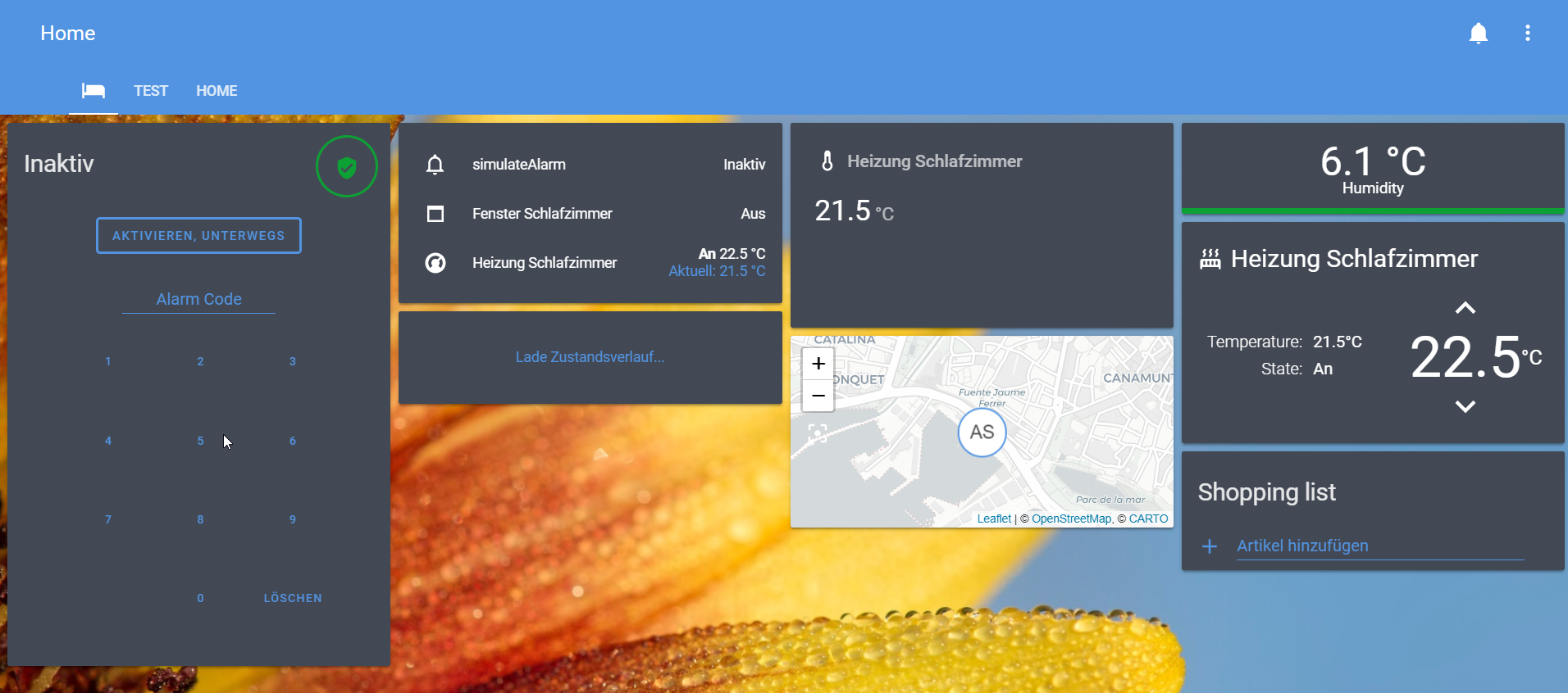
Hier mal ein paar Beispiele, was ich so mit lovelace realisiert habe.
Hauptsächlich verwende ich die button-card, da diese sehr viel Flexibilität ermöglicht und man so mit manuellen entities sehr gut arbeiten kann.
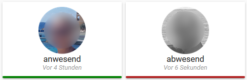
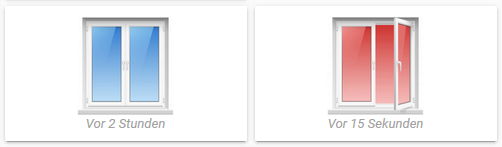
Anwesenheit
Fenster
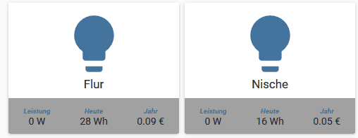
Licht - Schalter
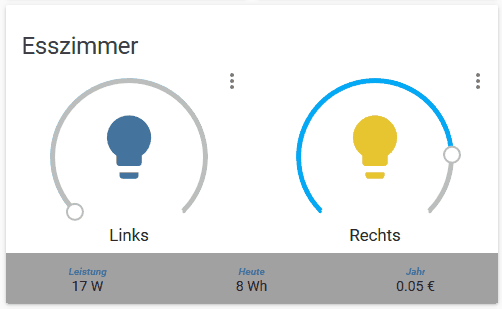
Licht - Dimmer
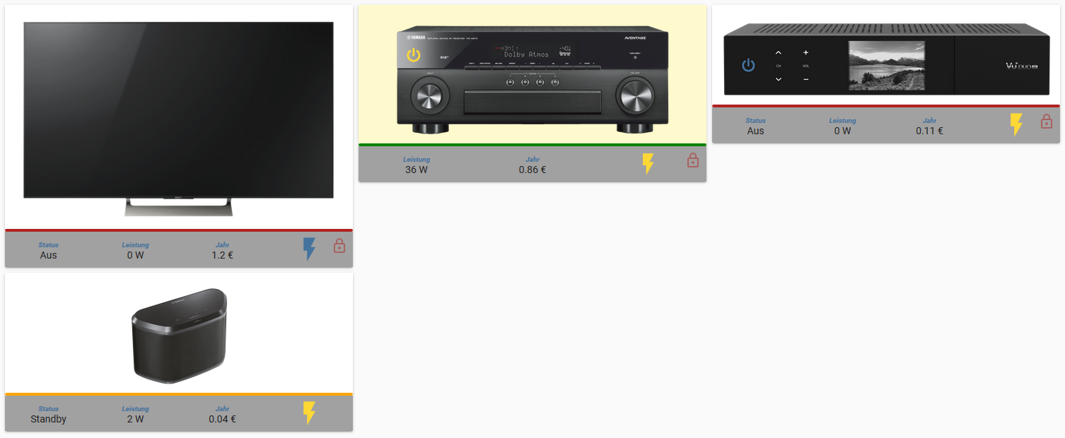
Geräte
Bar-Chart
@Scrounger sagte in Test Adapter lovelace v0.2.x:
Hier mal ein paar Beispiele, was ich so mit lovelace realisiert habe.
Hauptsächlich verwende ich die button-card, da diese sehr viel Flexibilität ermöglicht und man so mit manuellen entities sehr gut arbeiten kann.
Anwesenheit
Fenster
Licht - Schalter
Licht - Dimmer
Geräte
Bar-Chart
tolle arbeit, wie hast u das mit den Pictures gelöst. Wie lautet der Pfad im Iobroker?
Gruß -
@WW1983 Ich habe den Code kopiert, jedoch ändert sich nicht am Theme.
# Main colors primary-color: '#5294E2' # Header accent-color: '#E45E65' # Accent color dark-primary-color: 'var(--accent-color)' # Hyperlinks light-primary-color: 'var(--accent-color)' # Horizontal line in about ha-card-border-radius: '20px' ha-card-background: 'rgba(150, 150, 150, 0.1)' # Text colors primary-text-color: '#FFFFFF' # Primary text colour, here is referencing dark-primary-color text-primary-color: 'var(--primary-text-color)' # Primary text colour secondary-text-color: '#5294E2' # For secondary titles in more info boxes etc. disabled-text-color: '#7F848E' # Disabled text colour label-badge-border-color: 'green' # Label badge border, just a reference value # Background colors primary-background-color: '#383C45' # Settings background secondary-background-color: '#383C45' # Main card UI background divider-color: 'rgba(0, 0, 0, .12)' # Divider # Table rows table-row-background-color: '#353840' # Table row table-row-alternative-background-color: '#3E424B' # Table row alternative # Nav Menu paper-listbox-color: 'var(--primary-color)' # Navigation menu selection hoover paper-listbox-background-color: '#2E333A' # Navigation menu background paper-grey-50: 'var(--primary-text-color)' paper-grey-200: '#414A59' # Navigation menu selection # Paper card paper-card-header-color: 'var(--accent-color)' # Card header text colour paper-card-background-color: 'rgba(150, 150, 150, 0.1)' # Card background colour paper-dialog-background-color: '#434954' # Card dialog background colour paper-item-icon-color: 'var(--primary-text-color)' # Icon color paper-item-icon-active-color: '#F9C536' # Icon color active paper-item-icon_-_color: 'green' paper-item-selected_-_background-color: '#434954' # Popup item select paper-tabs-selection-bar-color: 'green' # Labels label-badge-red: 'var(--accent-color)' # References the brand colour label badge border label-badge-text-color: 'var(--primary-text-color)' # Now same as label badge border but that's a matter of taste label-badge-background-color: '#2E333A' # Same, but can also be set to transparent here label-badge-background: 'rgba(255, 255, 255, 0.1)' # Switches paper-toggle-button-checked-button-color: 'var(--accent-color)' paper-toggle-button-checked-bar-color: 'var(--accent-color)' paper-toggle-button-checked-ink-color: 'var(--accent-color)' paper-toggle-button-unchecked-button-color: 'var(--disabled-text-color)' paper-toggle-button-unchecked-bar-color: 'var(--disabled-text-color)' paper-toggle-button-unchecked-ink-color: 'var(--disabled-text-color)' # Sliders paper-slider-knob-color: 'var(--accent-color)' paper-slider-knob-start-color: 'var(--accent-color)' paper-slider-pin-color: 'var(--accent-color)' paper-slider-active-color: 'var(--accent-color)' paper-slider-container-color: 'linear-gradient(var(--primary-background-color), var(--secondary-background-color)) no-repeat' paper-slider-secondary-color: 'var(--secondary-background-color)' paper-slider-disabled-active-color: 'var(--disabled-text-color)' paper-slider-disabled-secondary-color: 'var(--disabled-text-color)' # Google colors google-red-500: '#E45E65' google-green-500: '#39E949'Hat bei mir auch nicht so funktioniert.
Du musst vorher "transparent:" hinzufügen, so:transparent: # Main colors primary-color: '#5294E2' # Header accent-color: '#E45E65' # Accent color dark-primary-color: 'var(--accent-color)' # Hyperlinks ........dann funktioniert es.
Ich habe noch das Hintergrund Bild bei den Cards hochgeladen und die Zeile Backround image hinzugefügt.
#Background images
background: center / cover no-repeat url("/cards/background.jpg") fixed
Host: Intel Nuc6cayh (16GB Ram, 240GB SSD) mit Proxmox.
Iobroker VM, InfluxDB LXC, Pihole LXC, Tasmoadmin LXC, Easy2connect VM
-
@WW1983 sagte in Test Adapter lovelace v0.2.x:
Hat jemand die Wetter-Card zum laufen gebracht? Bei mir werden keine Icons angezeigt. Das war aber nicht immer so.
Hast Du die Icon irgendwann mal selbst kopiert/hochgeladen und kann es sein dass dies erst seit der Aktualisierung auf js-controller v2.x so ist?, dann könnte es mit den Hinweisen hier zu tun haben.
Weiterhin wird der ioBroke-Eigene-Dateibereich (im Normalfall bisher unter <ioBroker-Verzeichnis>/iobroker-data/files/...) nun strikter behandelt und manuell oder per Skript (fs.write) dort direkt abgelegte/hinkopierte Dateien sind ggf. nicht mehr in Visualisierungen anzeigbar! Skripte müssen angepasst werden (Nutzung von writeFile) bzw. die Dateien müssen in offiziell definierte Adpater-Basisverzeichnisse (z.B. vis.0, iqontrol.meta u.ä.) abgelegt werden. Nutzt am besten auch die offiziellen Uploader via Vis oder iqontrol, damit diese Dateien korrekt registriert sind. Diese Änderung wurde auch zur Erhöhung der Sicherheit umgesetzt! Der positive Nebeneffekt ist auch das die Files dann mit im Backup landen, was bisher nicht gegeben war! -
@WW1983 sagte in Test Adapter lovelace v0.2.x:
Hat jemand die Wetter-Card zum laufen gebracht? Bei mir werden keine Icons angezeigt. Das war aber nicht immer so.
Hier das gleiche, hast du eine Lösung gefunden?
-
@WW1983 Ich habe den Code kopiert, jedoch ändert sich nicht am Theme.
# Main colors primary-color: '#5294E2' # Header accent-color: '#E45E65' # Accent color dark-primary-color: 'var(--accent-color)' # Hyperlinks light-primary-color: 'var(--accent-color)' # Horizontal line in about ha-card-border-radius: '20px' ha-card-background: 'rgba(150, 150, 150, 0.1)' # Text colors primary-text-color: '#FFFFFF' # Primary text colour, here is referencing dark-primary-color text-primary-color: 'var(--primary-text-color)' # Primary text colour secondary-text-color: '#5294E2' # For secondary titles in more info boxes etc. disabled-text-color: '#7F848E' # Disabled text colour label-badge-border-color: 'green' # Label badge border, just a reference value # Background colors primary-background-color: '#383C45' # Settings background secondary-background-color: '#383C45' # Main card UI background divider-color: 'rgba(0, 0, 0, .12)' # Divider # Table rows table-row-background-color: '#353840' # Table row table-row-alternative-background-color: '#3E424B' # Table row alternative # Nav Menu paper-listbox-color: 'var(--primary-color)' # Navigation menu selection hoover paper-listbox-background-color: '#2E333A' # Navigation menu background paper-grey-50: 'var(--primary-text-color)' paper-grey-200: '#414A59' # Navigation menu selection # Paper card paper-card-header-color: 'var(--accent-color)' # Card header text colour paper-card-background-color: 'rgba(150, 150, 150, 0.1)' # Card background colour paper-dialog-background-color: '#434954' # Card dialog background colour paper-item-icon-color: 'var(--primary-text-color)' # Icon color paper-item-icon-active-color: '#F9C536' # Icon color active paper-item-icon_-_color: 'green' paper-item-selected_-_background-color: '#434954' # Popup item select paper-tabs-selection-bar-color: 'green' # Labels label-badge-red: 'var(--accent-color)' # References the brand colour label badge border label-badge-text-color: 'var(--primary-text-color)' # Now same as label badge border but that's a matter of taste label-badge-background-color: '#2E333A' # Same, but can also be set to transparent here label-badge-background: 'rgba(255, 255, 255, 0.1)' # Switches paper-toggle-button-checked-button-color: 'var(--accent-color)' paper-toggle-button-checked-bar-color: 'var(--accent-color)' paper-toggle-button-checked-ink-color: 'var(--accent-color)' paper-toggle-button-unchecked-button-color: 'var(--disabled-text-color)' paper-toggle-button-unchecked-bar-color: 'var(--disabled-text-color)' paper-toggle-button-unchecked-ink-color: 'var(--disabled-text-color)' # Sliders paper-slider-knob-color: 'var(--accent-color)' paper-slider-knob-start-color: 'var(--accent-color)' paper-slider-pin-color: 'var(--accent-color)' paper-slider-active-color: 'var(--accent-color)' paper-slider-container-color: 'linear-gradient(var(--primary-background-color), var(--secondary-background-color)) no-repeat' paper-slider-secondary-color: 'var(--secondary-background-color)' paper-slider-disabled-active-color: 'var(--disabled-text-color)' paper-slider-disabled-secondary-color: 'var(--disabled-text-color)' # Google colors google-red-500: '#E45E65' google-green-500: '#39E949' -
-
@WW1983 hast du es hinbekommen den header transparent zu bekommen mit der compact-custom-header card ?
-
@WW1983
Ich habe alles mögliche versucht aber die Card hat nicht funktioniert.
Ich habe es auch nur dunkler gemacht -
@marcuskl
es funktionieren derzeit so einige Cards nicht. Ich hoffe das wird irgendwann noch behoben.Man kann zwar jetzt schon was brauchbares basteln. Aber schade das noch so vieles nicht funktioniert. Auch die "Standard-Entitys"
-
@WW1983 Ja des stimmt.
Ich würde gerne mal meine RGB Beleuchtungen einbinden, aber die light entiy card funktioniert auch noch nicht.
https://github.com/ljmerza/light-entity-card -
Hat bei mir auch nicht so funktioniert.
Du musst vorher "transparent:" hinzufügen, so:transparent: # Main colors primary-color: '#5294E2' # Header accent-color: '#E45E65' # Accent color dark-primary-color: 'var(--accent-color)' # Hyperlinks ........dann funktioniert es.
Ich habe noch das Hintergrund Bild bei den Cards hochgeladen und die Zeile Backround image hinzugefügt.
#Background images background: center / cover no-repeat url("/cards/background.jpg") fixed@marcuskl danke
transparent: # Main colors primary-color: '#5294E2' # Header accent-color: '#E45E65' # Accent color dark-primary-color: 'var(--accent-color)' # Hyperlinks light-primary-color: 'var(--accent-color)' # Horizontal line in about ha-card-border-radius: '20px' ha-card-background: 'rgba(150, 150, 150, 0.1)' # Text colors primary-text-color: '#FFFFFF' # Primary text colour, here is referencing dark-primary-color text-primary-color: 'var(--primary-text-color)' # Primary text colour secondary-text-color: '#5294E2' # For secondary titles in more info boxes etc. disabled-text-color: '#7F848E' # Disabled text colour label-badge-border-color: 'green' # Label badge border, just a reference value # Background colors primary-background-color: '#383C45' # Settings background secondary-background-color: '#383C45' # Main card UI background divider-color: 'rgba(0, 0, 0, .12)' # Divider # Table rows table-row-background-color: '#353840' # Table row table-row-alternative-background-color: '#3E424B' # Table row alternative # Nav Menu paper-listbox-color: 'var(--primary-color)' # Navigation menu selection hoover paper-listbox-background-color: '#2E333A' # Navigation menu background paper-grey-50: 'var(--primary-text-color)' paper-grey-200: '#414A59' # Navigation menu selection # Paper card paper-card-header-color: 'var(--accent-color)' # Card header text colour paper-card-background-color: 'rgba(150, 150, 150, 0.1)' # Card background colour paper-dialog-background-color: '#434954' # Card dialog background colour paper-item-icon-color: 'var(--primary-text-color)' # Icon color paper-item-icon-active-color: '#F9C536' # Icon color active paper-item-icon_-_color: 'green' paper-item-selected_-_background-color: '#434954' # Popup item select paper-tabs-selection-bar-color: 'green' # Labels label-badge-red: 'var(--accent-color)' # References the brand colour label badge border label-badge-text-color: 'var(--primary-text-color)' # Now same as label badge border but that's a matter of taste label-badge-background-color: '#2E333A' # Same, but can also be set to transparent here label-badge-background: 'rgba(255, 255, 255, 0.1)' # Switches paper-toggle-button-checked-button-color: 'var(--accent-color)' paper-toggle-button-checked-bar-color: 'var(--accent-color)' paper-toggle-button-checked-ink-color: 'var(--accent-color)' paper-toggle-button-unchecked-button-color: 'var(--disabled-text-color)' paper-toggle-button-unchecked-bar-color: 'var(--disabled-text-color)' paper-toggle-button-unchecked-ink-color: 'var(--disabled-text-color)' # Sliders paper-slider-knob-color: 'var(--accent-color)' paper-slider-knob-start-color: 'var(--accent-color)' paper-slider-pin-color: 'var(--accent-color)' paper-slider-active-color: 'var(--accent-color)' paper-slider-container-color: 'linear-gradient(var(--primary-background-color), var(--secondary-background-color)) no-repeat' paper-slider-secondary-color: 'var(--secondary-background-color)' paper-slider-disabled-active-color: 'var(--disabled-text-color)' paper-slider-disabled-secondary-color: 'var(--disabled-text-color)' # Google colors google-red-500: '#E45E65' google-green-500: '#39E949' # Background images background: center / cover no-repeat url("/cards/background.jpg") fixed -
Hi,
mal was zum Einstieg ehe ich mich tief darin verliere ;). Sollte man ebenfalls pro verschiedene Auflösung (z.B. Tablet & Smartphone) am besten 2 Views erstellen oder kann man das out of the box mit einer View bewerkstelligen.
Ansonsten klingt der Adapter sehr interessant und ich bin schon fleißig am rumprobieren. Guter Ansatz bzw. Umsetzung.
vg
Falk -
@Scrounger sagte in Test Adapter lovelace v0.2.x:
Hier mal ein paar Beispiele, was ich so mit lovelace realisiert habe.
Hauptsächlich verwende ich die button-card, da diese sehr viel Flexibilität ermöglicht und man so mit manuellen entities sehr gut arbeiten kann.
Anwesenheit
Fenster
Licht - Schalter
Licht - Dimmer
Geräte
Bar-Chart
tolle arbeit, wie hast u das mit den Pictures gelöst. Wie lautet der Pfad im Iobroker?
Gruß -
@g-polat
Glaub node-modules/lovelace/hass-irgendwa/static/
Bin Grad nicht am Rechner.Und da dann reinkopiert. Achtung nach Adapter Update sind die Bilder dann weg!
Könnte man den Ordner theoretisch mit Schreibschutz versehen, oder gibt dann ein Problem mit dem Update?

Hey! Du scheinst an dieser Unterhaltung interessiert zu sein, hast aber noch kein Konto.
Hast du es satt, bei jedem Besuch durch die gleichen Beiträge zu scrollen? Wenn du dich für ein Konto anmeldest, kommst du immer genau dorthin zurück, wo du zuvor warst, und kannst dich über neue Antworten benachrichtigen lassen (entweder per E-Mail oder Push-Benachrichtigung). Du kannst auch Lesezeichen speichern und Beiträge positiv bewerten, um anderen Community-Mitgliedern deine Wertschätzung zu zeigen.
Mit deinem Input könnte dieser Beitrag noch besser werden 💗
Registrieren AnmeldenSupport us
207
Online33.0k
Benutzer83.4k
Themen1.3m
Beiträge