
Schalter & Taster VIS-2
-
@tourer4778 sagte in Schalter & Taster VIS-2:
Hallo,
in meiner VIS-2-Ansicht nutze ich aktuell noch einige Widgets aus der alten VIS, zum Beispiel den „Button Toggle vertical“ aus dem Material Design-Paket.
Diese funktionieren zwar grundsätzlich noch, verursachen jedoch immer wieder Fehlermeldungen, die ich nun nach und nach beseitigen möchte.In meiner VIS-2 verwende ich einfache Schalter, die je nach Schaltzustand ihre Farbe ändern.
Welches aktuelle Widget eignet sich dafür am besten? Ich habe mir bereits alle verfügbaren Widgets angesehen, konnte aber keine passende Alternative finden.Außerdem noch eine Frage: Die Widgeteria lässt sich bei mir nicht öffnen, funktioniert sie derzeit generell nicht?
Beispiel

Für sowas kannst Du auch die vis-2-widgets-collection nutzen.
Wenn ich das richtig sehe, kann ich da auch nur mit Icons arbeiten.
Bei dem alten Button fand ich es toll, das ich nur die Farben angeben musste.
-
Wenn ich das richtig sehe, kann ich da auch nur mit Icons arbeiten.
Bei dem alten Button fand ich es toll, das ich nur die Farben angeben musste.
Willst du auch schalten oder nur eine Anzeige ?
-
Willst du auch schalten oder nur eine Anzeige ?
-
@sigi234
Schalten und den Schaltzustand anzeigen.Ich wusste nicht, das es in VIS-2 so schwer ist, ein Button einzubinden, der nur die Farbe ändert, je nach Zustand.
@tourer4778 sagte in Schalter & Taster VIS-2:
@sigi234
Schalten und den Schaltzustand anzeigen.Ich wusste nicht, das es in VIS-2 so schwer ist, ein Button einzubinden, der nur die Farbe ändert, je nach Zustand.
[
  {
    "tpl": "tplInventwoWidgetUniversal",
    "data": {
      "bindings": [],
      "type": "switch",
      "g_common": true,
      "mode": "singleButton",
      "direction": "column",
      "oid": "0_userdata.0.ON_OFF",
      "httpType": "send",
      "buttonSize": 41,
      "btnSpacing": 10,
      "countStates": 2,
      "buttonHoldValue": false,
      "dialogWidth": 500,
      "g_attr_group_type_view_in_dialog": true,
      "dialogHeight": 300,
      "dialogPadding": 10,
      "dialogBackground": "rgb(18, 18, 18)",
      "dialogTitleColor": "rgb(255,255,255)",
      "dialogTitleSize": 20,
      "dialogCloseButtonBackground": "rgba(255,255,255,0)",
      "dialogCloseButtonColor": "rgba(255,255,255,1)",
      "dialogCloseButtonSize": 14,
      "dialogBorderRadiusTopLeft": 12,
      "dialogBorderRadiusTopRight": 0,
      "dialogBorderRadiusBottomRight": 12,
      "dialogBorderRadiusBottomLeft": 0,
      "clickThrough": false,
      "g_attr_group_click_feedback": true,
      "feedbackDuration": 0,
      "backgroundFeedback": "",
      "outerShadowColorFeedback": "rgba(0, 0, 0, 1)",
      "contentBlinkInterval": 0,
      "g_attr_group_state_default": true,
      "outerShadowColor": "",
      "colorPickerColorModel": "hex",
      "g_attr_content_color_picker": true,
      "colorPickerWidth": 200,
      "colorPickerHandleSize": 8,
      "colorPickerHandleMargin": 6,
      "colorPickerComponentsSpace": 12,
      "colorPickerDirection": "vertical",
      "colorPickerBorderWidth": 0,
      "colorPickerShowWheel": true,
      "colorPickerShowSaturation": true,
      "colorPickerShowValue": true,
      "textDecoration": "none",
      "g_attr_group_css_text": true,
      "textMarginTop": 0,
      "textMarginBottom": 0,
      "textMarginLeft": 0,
      "textMarginRight": 0,
      "contentType": "html",
      "g_attr_group_css_content": true,
      "contentMarginTop": 0,
      "contentMarginBottom": 0,
      "contentMarginLeft": 0,
      "contentMarginRight": 0,
      "contentSize": 0,
      "contentRotation": 0,
      "contentMirror": false,
      "flexDirection": "row",
      "g_attr_group_css_alignment": true,
      "alignItems": "center",
      "textAlign": "center",
      "contentAlign": "center",
      "backgroundOpacity": 1,
      "g_attr_group_css_transparency": true,
      "contentOpacity": 1,
      "paddingLeft": 0,
      "g_attr_group_css_spacing": true,
      "paddingRight": 0,
      "paddingTop": 0,
      "paddingBottom": 0,
      "borderRadiusTopLeft": 0,
      "g_attr_group_css_border_radius": true,
      "borderRadiusTopRight": 0,
      "borderRadiusBottomRight": 0,
      "borderRadiusBottomLeft": 0,
      "borderSizeTop": 0,
      "g_attr_group_css_border": true,
      "borderSizeBottom": 0,
      "borderSizeLeft": 0,
      "borderSizeRight": 0,
      "borderStyle": "none",
      "outerShadowX": 0,
      "g_attr_group_css_outer_shadow": true,
      "outerShadowY": 0,
      "outerShadowBlur": 0,
      "outerShadowSize": 0,
      "innerShadowX": 0,
      "g_attr_group_css_inner_shadow": true,
      "innerShadowY": 0,
      "innerShadowBlur": 0,
      "innerShadowSize": 0,
      "undefined1": null,
      "compareBy1": "default",
      "oid1": "0_userdata.0.ON_OFF",
      "comparisonOperator1": "===",
      "value1": "false",
      "view1": null,
      "text1": "LICHT 1 OFF",
      "textTrue1": "LICHT 1 ON",
      "icon1": null,
      "iconTrue1": null,
      "image1": null,
      "imageTrue1": null,
      "html1": null,
      "htmlTrue1": null,
      "viewInWidget1": null,
      "viewInWidgetTrue1": null,
      "contentBlinkInterval1": null,
      "stateColorsStyleFromWidget1": null,
      "contentColor1": "",
      "contentColorTrue1": "",
      "background1": "rgba(249,33,16,1)",
      "backgroundTrue1": "rgba(6,241,71,1)",
      "textColor1": "rgba(0,0,0,1)",
      "textColorTrue1": "rgba(0,0,0,1)",
      "borderColor1": null,
      "borderColorTrue1": null,
      "outerShadowColor1": "rgb(0,0,0)",
      "outerShadowColorTrue1": "rgb(0,0,0)",
      "innerShadowColor1": null,
      "innerShadowColorTrue1": null,
      "contentSize1": null,
      "g_countStates-1": true,
      "valueFalse": "false",
      "valueTrue": "true",
      "undefined2": null,
      "compareBy2": "default",
      "oid2": "0_userdata.0.ON_OFF",
      "comparisonOperator2": "===",
      "value2": "true",
      "view2": null,
      "text2": "LICHT 1 ON",
      "textTrue2": null,
      "icon2": null,
      "iconTrue2": null,
      "image2": null,
      "imageTrue2": null,
      "html2": null,
      "htmlTrue2": null,
      "viewInWidget2": null,
      "viewInWidgetTrue2": null,
      "contentBlinkInterval2": 0,
      "stateColorsStyleFromWidget2": null,
      "contentColor2": null,
      "contentColorTrue2": null,
      "background2": "rgba(33,234,2,1)",
      "backgroundTrue2": "rgb(69,86,24)",
      "textColor2": "rgba(2,2,2,1)",
      "textColorTrue2": null,
      "borderColor2": null,
      "borderColorTrue2": null,
      "outerShadowColor2": "rgb(0,0,0)",
      "outerShadowColorTrue2": "rgb(0,0,0)",
      "innerShadowColor2": null,
      "innerShadowColorTrue2": null,
      "contentSize2": 0,
      "g_countStates-2": true
    },
    "style": {
      "bindings": [],
      "left": "964px",
      "top": "50px",
      "width": "177px",
      "height": "52px",
      "position": "absolute",
      "overflow": "visible",
      "z-index": "4"
    },
    "widgetSet": "vis-2-widgets-inventwo",
    "_id": "i000001"
  }
]
Objekt ID's anpassen.
-
Wenn ich das richtig sehe, kann ich da auch nur mit Icons arbeiten.
Bei dem alten Button fand ich es toll, das ich nur die Farben angeben musste.
@tourer4778 sagte in Schalter & Taster VIS-2:
Wenn ich das richtig sehe, kann ich da auch nur mit Icons arbeiten.
Bei dem alten Button fand ich es toll, das ich nur die Farben angeben musste.
Dann lass die Icons doch einfach weg.

-
@tourer4778 sagte in Schalter & Taster VIS-2:
Wenn ich das richtig sehe, kann ich da auch nur mit Icons arbeiten.
Bei dem alten Button fand ich es toll, das ich nur die Farben angeben musste.
Dann lass die Icons doch einfach weg.
@carsten04
Das bekomme ich irgendwie nicht hin, kannst du mir das Wiget mal Exportieren? -
@carsten04
Das bekomme ich irgendwie nicht hin, kannst du mir das Wiget mal Exportieren?@tourer4778 sagte in Schalter & Taster VIS-2:
@carsten04
Das bekomme ich irgendwie nicht hin, kannst du mir das Wiget mal Exportieren?[ { "tpl": "tplStateCollectionWidget", "data": { "bindings": [], "iconXOffset": "0px", "g_common": true, "iconYOffset": "0px", "noHeaderIcon": false, "header": "", "footer": "", "basePadding": 1, "baseElevation": 4, "oid": "0_userdata.0.example_state", "unit": "", "g_button": true, "values_count": 2, "sampleInterval": false, "sampleIntervalValue": 200, "delay": 300, "onlyStates": true, "statePushButton": false, "onlyDisplay": false, "oidType": "boolean", "write": true, "minValue": 0, "maxValue": 100, "icon": "", "value1": true, "alias1": "Licht", "value2": false, "alias2": "Licht", "noHeader": true, "noFooter": true, "backgroundColor1": "rgba(24,195,17,1)", "backgroundColor2": "rgba(201,17,37,1)", "valueSize": 289, "outlined": false, "outlinedFrame": true, "frameBackgroundColor2": "", "ellipse": false, "circle": false }, "style": { "bindings": [], "left": "122px", "top": "104px", "width": "126.962px", "height": "71.9292px", "position": "" }, "widgetSet": "vis-2-widgets-collection", "_id": "i000001" } ]HIER findest Du zu den Widgets viele Infos, die Dir ggf. noch wieter helfen können.
-
@tourer4778 sagte in Schalter & Taster VIS-2:
@carsten04
Das bekomme ich irgendwie nicht hin, kannst du mir das Wiget mal Exportieren?[ { "tpl": "tplStateCollectionWidget", "data": { "bindings": [], "iconXOffset": "0px", "g_common": true, "iconYOffset": "0px", "noHeaderIcon": false, "header": "", "footer": "", "basePadding": 1, "baseElevation": 4, "oid": "0_userdata.0.example_state", "unit": "", "g_button": true, "values_count": 2, "sampleInterval": false, "sampleIntervalValue": 200, "delay": 300, "onlyStates": true, "statePushButton": false, "onlyDisplay": false, "oidType": "boolean", "write": true, "minValue": 0, "maxValue": 100, "icon": "", "value1": true, "alias1": "Licht", "value2": false, "alias2": "Licht", "noHeader": true, "noFooter": true, "backgroundColor1": "rgba(24,195,17,1)", "backgroundColor2": "rgba(201,17,37,1)", "valueSize": 289, "outlined": false, "outlinedFrame": true, "frameBackgroundColor2": "", "ellipse": false, "circle": false }, "style": { "bindings": [], "left": "122px", "top": "104px", "width": "126.962px", "height": "71.9292px", "position": "" }, "widgetSet": "vis-2-widgets-collection", "_id": "i000001" } ]HIER findest Du zu den Widgets viele Infos, die Dir ggf. noch wieter helfen können.
@carsten04
super, danke dir / euch, ich denke, das ist genau das, was ich brauche. -
@carsten04
super, danke dir / euch, ich denke, das ist genau das, was ich brauche.Also das mit dem Button gestaltet sich immer mehr als schwierig. Ich wollte dieses WE weiter testen und jetzt klappt es mit der Beschriftung nicht.
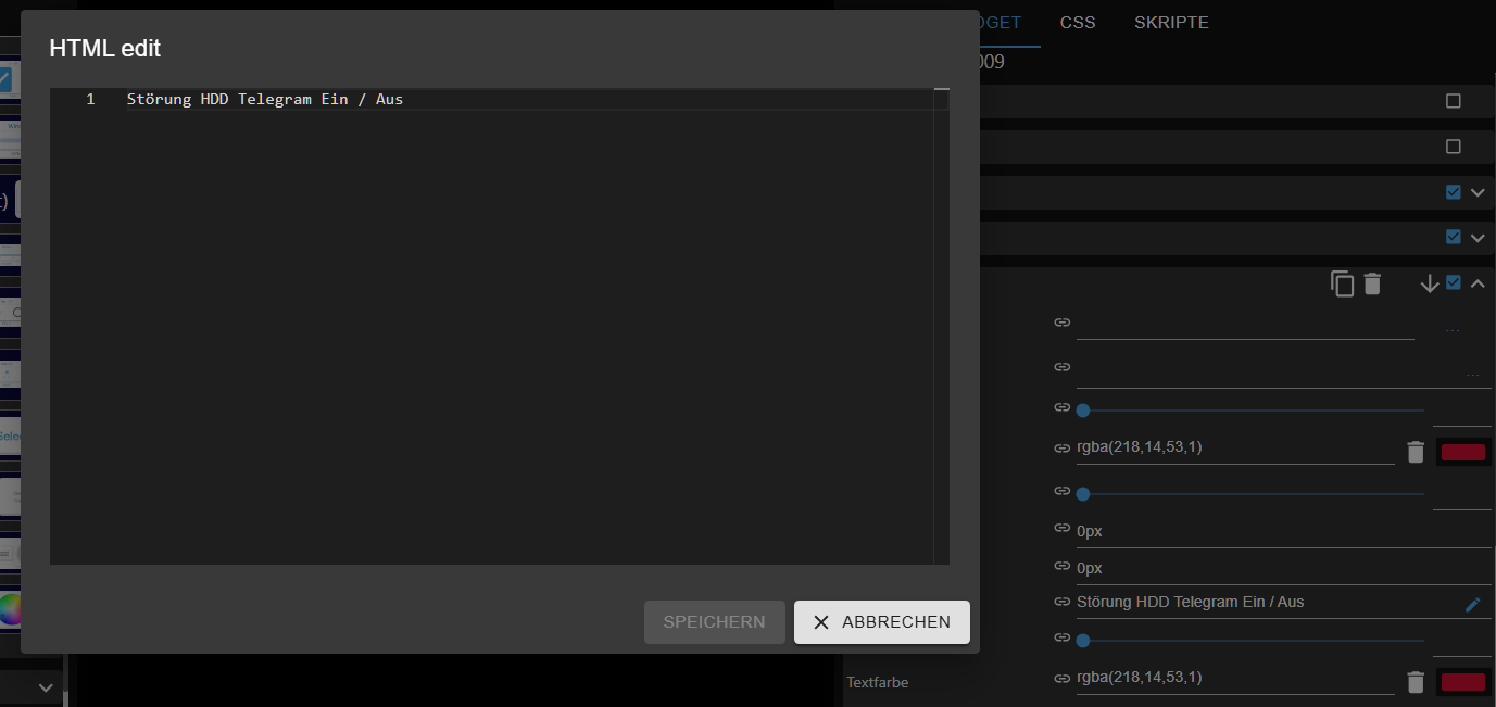
Die Zeilenaufteilung (<br>)übernimmt er nicht und wenn ich keine nutz kommt sowas bei rum.
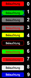
Ich nutze mehrere Farben und Ränder für meine VIS-2, zum beispiel kann eine Beleuchtung je nacht funktion und Ort 4 unterschiedliche farben haben. Derzeit sind diese übereinander und je nach Wert Sichtbar.
Mache ich das zu kompliziert, oder gibt es vielleicht eine einfachere Lösung? Ich bin offen für neue Ansätze. -
Also das mit dem Button gestaltet sich immer mehr als schwierig. Ich wollte dieses WE weiter testen und jetzt klappt es mit der Beschriftung nicht.
Die Zeilenaufteilung (<br>)übernimmt er nicht und wenn ich keine nutz kommt sowas bei rum.
Ich nutze mehrere Farben und Ränder für meine VIS-2, zum beispiel kann eine Beleuchtung je nacht funktion und Ort 4 unterschiedliche farben haben. Derzeit sind diese übereinander und je nach Wert Sichtbar.
Mache ich das zu kompliziert, oder gibt es vielleicht eine einfachere Lösung? Ich bin offen für neue Ansätze.@tourer4778 Wenn Du das Statewidget aus der Collection nimmst, dann sieht das z.B. so aus:

Der Export dazu:
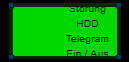
[
  {
    "tpl": "tplStateCollectionWidget",
    "data": {
      "bindings": [],
      "iconXOffset": "0px",
      "g_common": true,
      "iconYOffset": "0px",
      "noHeaderIcon": true,
      "header": "",
      "footer": "",
      "basePadding": 0,
      "baseElevation": 0,
      "oid": "0_userdata.0.Neues_Gerät.Neuer_Kanal.Neuer_Zustand",
      "unit": "",
      "g_button": true,
      "values_count": 2,
      "sampleInterval": false,
      "sampleIntervalValue": 200,
      "delay": 0,
      "onlyStates": true,
      "statePushButton": false,
      "onlyDisplay": false,
      "oidType": "boolean",
      "write": true,
      "minValue": 0,
      "maxValue": 100,
      "icon": "../vis-icontwo/Brands/telegram.png",
      "value1": true,
      "alias1": "Störung HDD Telegram Ein / Aus",
      "value2": false,
      "alias2": "Störung HDD Telegram Ein / Aus",
      "iconSize": 100,
      "noHeader": true,
      "noFooter": true,
      "iconColor2": "rgba(55,201,24,1)",
      "textColor2": "rgba(55,201,24,1)",
      "iconColor1": "rgba(218,14,53,1)",
      "textColor1": "rgba(218,14,53,1)",
      "backgroundColor1": "rgba(74,19,32,1)",
      "backgroundColor2": "rgba(28,55,19,1)",
      "outlinedFrame": false,
      "outlined": true
    },
    "style": {
      "bindings": [],
      "left": "107.98580932617188px",
      "top": "72px",
      "width": "265.958px",
      "height": "106.967px",
      "position": ""
    },
    "widgetSet": "vis-2-widgets-collection",
    "_id": "i000001"
  },
  {
    "tpl": "tplStateCollectionWidget",
    "data": {
      "bindings": [],
      "iconXOffset": "0px",
      "g_common": true,
      "iconYOffset": "0px",
      "noHeaderIcon": true,
      "header": "",
      "footer": "",
      "basePadding": 0,
      "baseElevation": 0,
      "oid": "0_userdata.0.Neues_Gerät.Neuer_Kanal.Neuer_Zustand",
      "unit": "",
      "g_button": true,
      "values_count": 2,
      "sampleInterval": false,
      "sampleIntervalValue": 200,
      "delay": 0,
      "onlyStates": true,
      "statePushButton": false,
      "onlyDisplay": false,
      "oidType": "boolean",
      "write": true,
      "minValue": 0,
      "maxValue": 100,
      "icon": "../vis-icontwo/Brands/telegram.png",
      "value1": true,
      "alias1": "Störung HDD Telegram Ein / Aus",
      "value2": false,
      "alias2": "Störung HDD Telegram Ein / Aus",
      "iconSize": 100,
      "noHeader": true,
      "noFooter": true,
      "iconColor2": "rgba(55,201,24,1)",
      "textColor2": "rgba(55,201,24,1)",
      "iconColor1": "rgba(218,14,53,1)",
      "textColor1": "rgba(218,14,53,1)",
      "backgroundColor1": "rgba(74,19,32,1)",
      "backgroundColor2": "rgba(28,55,19,1)",
      "outlinedFrame": false,
      "outlined": true,
      "noIcon": true
    },
    "style": {
      "bindings": [],
      "left": "153.50231170654297px",
      "top": "180px",
      "width": "174.929px",
      "height": "59.9528px",
      "position": ""
    },
    "widgetSet": "vis-2-widgets-collection",
    "_id": "i000002"
  }
]
Über den ALIAS-Editor (HTML-Editor) von Wert[1] und Wert[2] kannst Du die Werte mit CSS beliebig formatieren.
Deinen zweiten Case habe ich noch nicht verstanden. Den müsstest Du mal genauer erklären. Willst Du Farben setzen, anzeigen, beides? Du sprichst von vier Farben, zeigst aber 10 Fälle an.
-
@tourer4778 Wenn Du das Statewidget aus der Collection nimmst, dann sieht das z.B. so aus:
Der Export dazu:
[
  {
    "tpl": "tplStateCollectionWidget",
    "data": {
      "bindings": [],
      "iconXOffset": "0px",
      "g_common": true,
      "iconYOffset": "0px",
      "noHeaderIcon": true,
      "header": "",
      "footer": "",
      "basePadding": 0,
      "baseElevation": 0,
      "oid": "0_userdata.0.Neues_Gerät.Neuer_Kanal.Neuer_Zustand",
      "unit": "",
      "g_button": true,
      "values_count": 2,
      "sampleInterval": false,
      "sampleIntervalValue": 200,
      "delay": 0,
      "onlyStates": true,
      "statePushButton": false,
      "onlyDisplay": false,
      "oidType": "boolean",
      "write": true,
      "minValue": 0,
      "maxValue": 100,
      "icon": "../vis-icontwo/Brands/telegram.png",
      "value1": true,
      "alias1": "Störung HDD Telegram Ein / Aus",
      "value2": false,
      "alias2": "Störung HDD Telegram Ein / Aus",
      "iconSize": 100,
      "noHeader": true,
      "noFooter": true,
      "iconColor2": "rgba(55,201,24,1)",
      "textColor2": "rgba(55,201,24,1)",
      "iconColor1": "rgba(218,14,53,1)",
      "textColor1": "rgba(218,14,53,1)",
      "backgroundColor1": "rgba(74,19,32,1)",
      "backgroundColor2": "rgba(28,55,19,1)",
      "outlinedFrame": false,
      "outlined": true
    },
    "style": {
      "bindings": [],
      "left": "107.98580932617188px",
      "top": "72px",
      "width": "265.958px",
      "height": "106.967px",
      "position": ""
    },
    "widgetSet": "vis-2-widgets-collection",
    "_id": "i000001"
  },
  {
    "tpl": "tplStateCollectionWidget",
    "data": {
      "bindings": [],
      "iconXOffset": "0px",
      "g_common": true,
      "iconYOffset": "0px",
      "noHeaderIcon": true,
      "header": "",
      "footer": "",
      "basePadding": 0,
      "baseElevation": 0,
      "oid": "0_userdata.0.Neues_Gerät.Neuer_Kanal.Neuer_Zustand",
      "unit": "",
      "g_button": true,
      "values_count": 2,
      "sampleInterval": false,
      "sampleIntervalValue": 200,
      "delay": 0,
      "onlyStates": true,
      "statePushButton": false,
      "onlyDisplay": false,
      "oidType": "boolean",
      "write": true,
      "minValue": 0,
      "maxValue": 100,
      "icon": "../vis-icontwo/Brands/telegram.png",
      "value1": true,
      "alias1": "Störung HDD Telegram Ein / Aus",
      "value2": false,
      "alias2": "Störung HDD Telegram Ein / Aus",
      "iconSize": 100,
      "noHeader": true,
      "noFooter": true,
      "iconColor2": "rgba(55,201,24,1)",
      "textColor2": "rgba(55,201,24,1)",
      "iconColor1": "rgba(218,14,53,1)",
      "textColor1": "rgba(218,14,53,1)",
      "backgroundColor1": "rgba(74,19,32,1)",
      "backgroundColor2": "rgba(28,55,19,1)",
      "outlinedFrame": false,
      "outlined": true,
      "noIcon": true
    },
    "style": {
      "bindings": [],
      "left": "153.50231170654297px",
      "top": "180px",
      "width": "174.929px",
      "height": "59.9528px",
      "position": ""
    },
    "widgetSet": "vis-2-widgets-collection",
    "_id": "i000002"
  }
]
Über den ALIAS-Editor (HTML-Editor) von Wert[1] und Wert[2] kannst Du die Werte mit CSS beliebig formatieren.
Deinen zweiten Case habe ich noch nicht verstanden. Den müsstest Du mal genauer erklären. Willst Du Farben setzen, anzeigen, beides? Du sprichst von vier Farben, zeigst aber 10 Fälle an.
@carsten04
Danke,
was ich meine, ich versuche verschiedene zustände anzuzeigen.
Zumbeispiel wenn ein Gerät Offline ist, weil es kein Wlansignal hat, dann soll der Button mir das so auch anzeigen.
Dazu habe ich verschiedene Button hintereinander gelegt, und je nach zustand, angezeigt. -
@carsten04
Danke,
was ich meine, ich versuche verschiedene zustände anzuzeigen.
Zumbeispiel wenn ein Gerät Offline ist, weil es kein Wlansignal hat, dann soll der Button mir das so auch anzeigen.
Dazu habe ich verschiedene Button hintereinander gelegt, und je nach zustand, angezeigt.@tourer4778 Was hat die Beleuchtug (Farben) denn jetzt mit einem Wlansignal zu tun? Und meinst du mit hintereinanderlegen übereinanderlegen? Und wenn ja was wird dann angezeigt wenn zwei deiner Geräte kein Wlansignal mehr haben? Bekommst Du dann nur von einem Gerät mit dass es nicht funktioniert?
Versuche mal bitte einen Case "sauber" zu beschreiben. Was willst Du wie und womit erreichen und was hast Du wie bisher versucht zu realisieren. -
@carsten04
Ja, ich lege derzeit mehrere Buttons hintereinander oder Übereinander, diese sind aber alle für das gleiche Gerät !
Zum Beispiel, hat die Lampe ganz normal WLan ist der Button Rot für aus, Grün für ein (Ein Button). Hat die Lampe kein Wlan, erschein ein anderer Button, der nur Grau ist, was für mich bedeutet, sie ist Offline, warum auch immer ! Ich habe auch andere Geräte, die eine Zeitschaltuhr haben, wo dann ein Rand erscheint mit Uhrsymbol, wenn diese an sind. So erkenne ich, Das die Weihnachtsbeleuchtung über Timer an gegangen ist und nicht manuell eingeschaltet. Ich habe auch welche für meine Gartenhütte, deren Strom ich komplett weg schalte und diese zeigen mir dann auch an, das sie keinen Strom haben bzw nicht geschaltet werden können usw. Alle im allen immer einheitlich für jedes Gerät, je nach Funktion.
Und jetzt war meine frage, ob es dafür ev. auch ein Widget gibt (Wunschdenken). -
@carsten04
Ja, ich lege derzeit mehrere Buttons hintereinander oder Übereinander, diese sind aber alle für das gleiche Gerät !
Zum Beispiel, hat die Lampe ganz normal WLan ist der Button Rot für aus, Grün für ein (Ein Button). Hat die Lampe kein Wlan, erschein ein anderer Button, der nur Grau ist, was für mich bedeutet, sie ist Offline, warum auch immer ! Ich habe auch andere Geräte, die eine Zeitschaltuhr haben, wo dann ein Rand erscheint mit Uhrsymbol, wenn diese an sind. So erkenne ich, Das die Weihnachtsbeleuchtung über Timer an gegangen ist und nicht manuell eingeschaltet. Ich habe auch welche für meine Gartenhütte, deren Strom ich komplett weg schalte und diese zeigen mir dann auch an, das sie keinen Strom haben bzw nicht geschaltet werden können usw. Alle im allen immer einheitlich für jedes Gerät, je nach Funktion.
Und jetzt war meine frage, ob es dafür ev. auch ein Widget gibt (Wunschdenken).@tourer4778
Hi,das Thema "Buttons übereinander" platzieren und mit DP-Zuständen koppeln, nutze ich auch sehr intensiv. Wenn es da etwas zur Vereinfachung gäbe, wäre es super. Im Designer ist das ja recht verwirrend, wenn mehrere Elemente übereinander liegen. Gruß, hf
-
@tourer4778
Hi,das Thema "Buttons übereinander" platzieren und mit DP-Zuständen koppeln, nutze ich auch sehr intensiv. Wenn es da etwas zur Vereinfachung gäbe, wäre es super. Im Designer ist das ja recht verwirrend, wenn mehrere Elemente übereinander liegen. Gruß, hf
@fuzzy1955 sagte in Schalter & Taster VIS-2:
Da bin ich bei dir.
Wenn man seine VIS das dritte mal anpackt, möchte man auch besser machen.
Wobei das mit dem Gruppieren in VIS-2 alles andere als schön ist derzeit, oder funktioniert das jetzt? -
@fuzzy1955 sagte in Schalter & Taster VIS-2:
Da bin ich bei dir.
Wenn man seine VIS das dritte mal anpackt, möchte man auch besser machen.
Wobei das mit dem Gruppieren in VIS-2 alles andere als schön ist derzeit, oder funktioniert das jetzt?Ich gruppiere Elemente im VIS-2 sehr selten. Das macht oft Probleme, wenn man im nachhinein etwas ändern möchte. Dann "fliegen" die entgruppierten Elemente irgendwo herum. Ich kann damit leben.
-
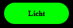
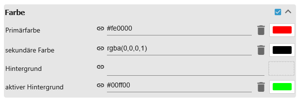
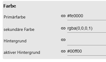
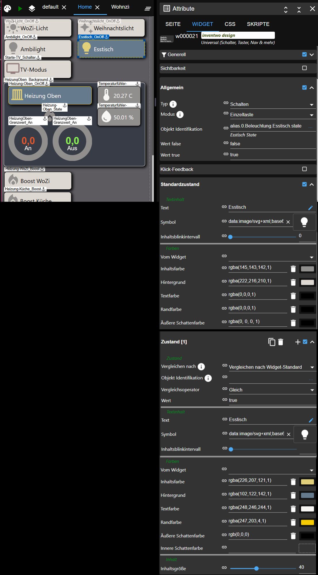
Mit dem "Universal Widget" der VIS2-inventwo-Widgets können n Zustände für ein Widget eingestellt werden. Ich nutze das ebenfalls zur Darstellung von unterschiedlichen Farben und Symbolen:
Beispiel ein Button zum Schalten einer Leuchte "Esstisch", aktuell ist sie eingeschaltet; zum Vergleich: die Leuchte links daneben "Ambilight" ist ausgeschaltet.
Es können weitere Zustands-Definitionen hinzugefügt sowie einfach verschoben und gelöscht werden:
Hey! Du scheinst an dieser Unterhaltung interessiert zu sein, hast aber noch kein Konto.
Hast du es satt, bei jedem Besuch durch die gleichen Beiträge zu scrollen? Wenn du dich für ein Konto anmeldest, kommst du immer genau dorthin zurück, wo du zuvor warst, und kannst dich über neue Antworten benachrichtigen lassen (entweder per E-Mail oder Push-Benachrichtigung). Du kannst auch Lesezeichen speichern und Beiträge positiv bewerten, um anderen Community-Mitgliedern deine Wertschätzung zu zeigen.
Mit deinem Input könnte dieser Beitrag noch besser werden 💗
Registrieren AnmeldenSupport us
557
Online32.9k
Benutzer83.2k
Themen1.3m
Beiträge