Test Adapter flexcharts - Stapeldiagramme und mehr
-
hab hier mal 2 Charts gebaut. Dank geht an
@jrbwh für die Grundidee und ChatGPT:// // Create chart for Tibber data. To be used with flexcharts. // // Sample http request for hourly data chart: // http://localhost:8082/flexcharts/echarts.html?source=script&message=tibber&chart=hourly // // Replace 'MY-TOKEN' with your own token: const ID_TIBBER = 'tibberlink.0.Homes.MY-TOKEN.Consumption'; const IDS = { hourly: '.jsonHourly', // hourly data daily: '.jsonDaily', // daily data weekly: '.jsonWeekly', // weekly data monthly: '.jsonMonthly' // monthly data }; onMessage('tibber', (httpParams, callback) => { // Use hourly data in case of invalid chart type const id = (httpParams.chart && httpParams.chart in IDS ? ID_TIBBER+IDS[httpParams.chart] : ID_TIBBER+IDS['hourly']); if (existsState(id)) { evalTibberData(httpParams.chart, id, result => callback(result)); } else { console.log('Requested state is not available >>'+id+'<<'); callback({title: { left: "center", textStyle: { color: "#ff0000" }, text: "REQUESTED STATE IS NOT AVAILABLE: >>" + id +"<<" }}); } }); function evalTibberData(myChart, id, callback) { const tibber = JSON.parse(getState(id).val); // Read tibber data const chart = { tooltip: { trigger: "axis", axisPointer: { type: "cross" }}, legend: { show: true, orient: "horizontal", left: "center", top: 25 }, title: { left: "center", text: "Tibber " }, grid: { right: "20%" }, toolbox: { feature: { dataView: { show: true, readOnly: false }, restore: { show: true }, saveAsImage: { show: true }}}, xAxis: [{ type: "category", axisTick: { alignWithLabel: true }, data: []}], yAxis: [{ type: "value", position: "left", alignTicks: true, axisLine: { show: true, lineStyle: { color: "#5470C6" }}, axisLabel: { formatter: "{value} kWh" }}, { type: "value", position: "right", alignTicks: true, axisLine: { show: true, lineStyle: { color: "#91CC75" }}, axisLabel: { formatter: "{value} €" }}], series: [{ name: "Consumption", type: "bar", yAxisIndex: 0, data: []}, { name: "Cost", type: "bar", yAxisIndex: 1, data: []}] }; const xAxis = []; const yAxis0 = []; const yAxis1 = []; for (const data of Object.values(tibber)) { const isHourly = (myChart == 'hourly'); // Hourly data? const xValue = (isHourly ? new Date(data.from).toLocaleTimeString() : new Date(data.from).toLocaleDateString()); xAxis.push(xValue); yAxis0.push((data.consumption ? data.consumption.toFixed(2) : 0)); // push 0 on null values yAxis1.push((data.cost ? data.cost.toFixed(2) : 0)); // push 0 on null values } chart.xAxis[0].data = xAxis; // Set chart x-axis data chart.series[0].data = yAxis0; // Set chart y-values consumption chart.series[1].data = yAxis1; // Set chart y-values cost chart.title.text = "Tibber stündliche Kosten"; // Add type of chart to title console.log('Evaluation of tibber '+myChart+' data done.'); callback(chart); }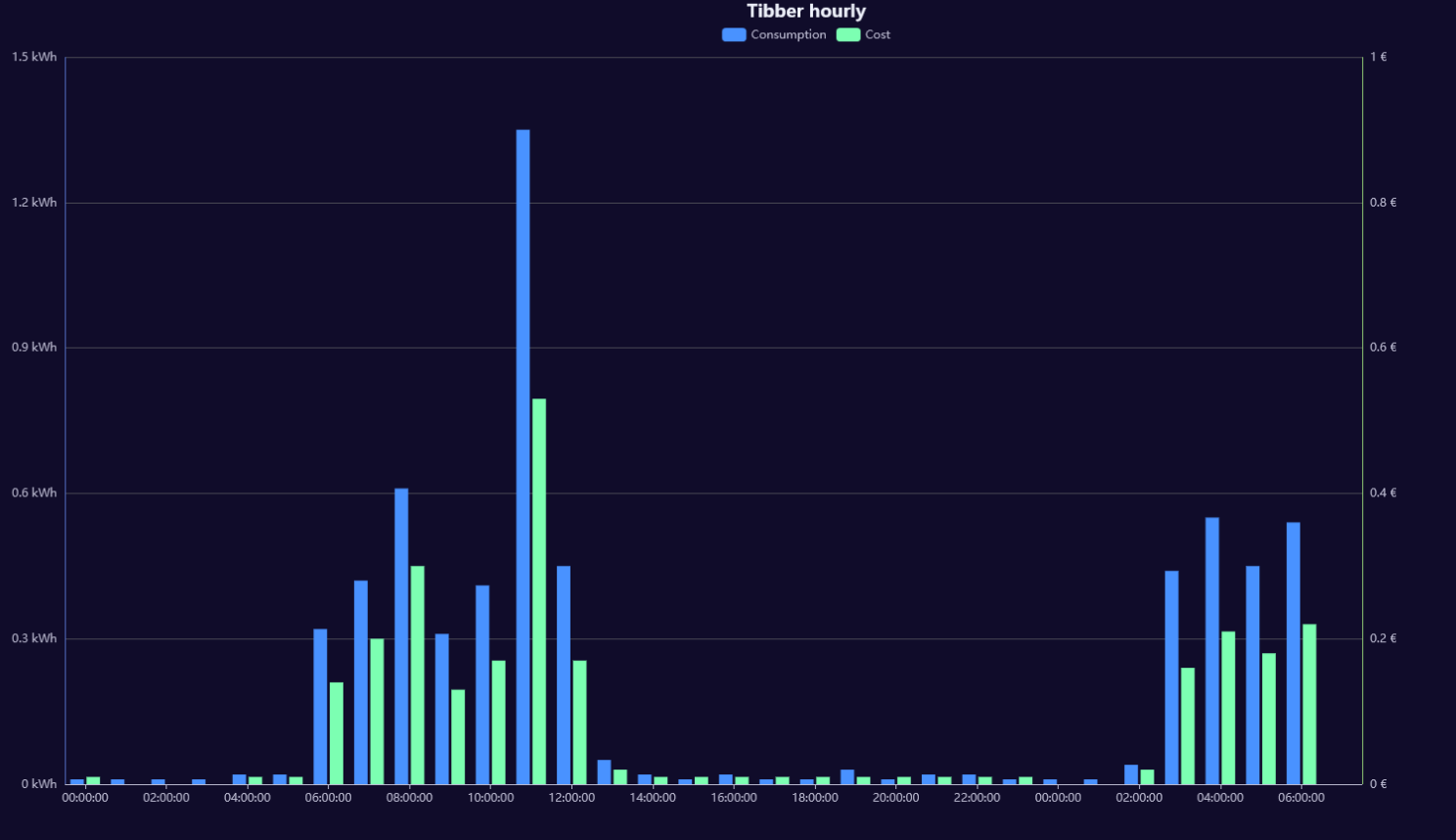
und das hier:
//http://localhost:8082/flexcharts/echarts.html?source=script&message=tibberpreis&chart=hourly&darkmode
const ID_TIBBER = 'tibberlink.0.Homes.MY-HOME-ID.PricesToday';

onMessage('tibberpreis', (httpParams, callback) => {
    console.log("Anfrage für Tibber-Daten:", httpParams);

    const id = ID_TIBBER + '.json'; // Stündliche Daten für heute

    if (existsState(id)) {
        evalTibberData(id, result => callback(result));
    } else {
        console.warn('Datenpunkt nicht verfügbar:', id);
        callback({
            title: {
                left: "center",
                textStyle: { color: "#ff0000" },
                text: "Daten nicht verfügbar: >>" + id + "<<"
            }
        });
    }
});

function evalTibberData(id, callback) {
    console.log("Lese Tibber-Daten:", id);

    let tibber;
    try {
        tibber = JSON.parse(getState(id).val);
        console.log("Tibber-Daten geladen:", tibber);
    } catch (error) {
        console.error("Fehler beim Parsen:", error);
        callback({
            title: { left: "center", textStyle: { color: "#ff0000" }, text: "FEHLER BEIM PARSEN" }
        });
        return;
    }

    if (!Array.isArray(tibber) || tibber.length === 0) {
        console.error("Keine gültigen Daten:", tibber);
        callback({
            title: { left: "center", textStyle: { color: "#ff0000" }, text: "KEINE GÜLTIGEN DATEN VERFÜGBAR" }
        });
        return;
    }

    console.log("Verarbeite", tibber.length, "Einträge.");

    const currentHour = new Date().getHours(); // Aktuelle Stunde holen
    console.log("Aktuelle Stunde:", currentHour);

    const chart = {
        tooltip: {
            trigger: "axis",
            axisPointer: { type: "shadow" },
            formatter: function (params) {
                let energyPrice = 0;
                let taxPrice = 0;
                let totalPrice = 0;

                // Berechne die Werte von Energiepreis, Steuern und Gesamtkosten aus den aktuellen Tooltip-Elementen
                params.forEach(function (item) {
                    if (item.seriesName === "Energiepreis") {
                        energyPrice = item.value;
                    } else if (item.seriesName === "Steuern") {
                        taxPrice = item.value;
                    } else if (item.seriesName === "Gesamtkosten") {
                        totalPrice = item.value;
                    }
                });

                // Zeige die Summe von Energiepreis und Steuern im Tooltip an
                return `
                    <div>
                        <strong>${params[0].name}</strong><br />
                        Energiepreis: ${energyPrice} €/kWh<br />
                        Steuern: ${taxPrice} €/kWh<br />
                        <strong>Gesamtkosten: ${totalPrice} €/kWh</strong>
                    </div>
                `;
            }
        },
        legend: { show: true, left: "center", top: 25 },
        title: { left: "center", text: "Tibberpreis heute" }, // Neuer Titel
        grid: { right: "10%" },
        toolbox: {
            feature: {
                dataView: { show: true, readOnly: false },
                restore: { show: true },
                saveAsImage: { show: true }
            }
        },
        xAxis: [{ type: "category", axisTick: { alignWithLabel: true }, data: [] }],
        yAxis: [{ type: "value", position: "left", axisLabel: { formatter: "{value} €/kWh" }}],
        series: [
            { name: "Energiepreis", type: "bar", stack: "cost", data: [] },
            { name: "Steuern", type: "bar", stack: "cost", data: [] },
            { name: "Gesamtkosten", type: "bar", data: [], itemStyle: { color: "green", borderColor: "black", borderWidth: 2 } } // Separate Serie für Gesamtkosten
        ]
    };

    const xAxis = [];
    const energyPrices = [];
    const taxPrices = [];
    const totalPrices = []; // Neues Array für Gesamtkosten

    for (const data of tibber) {
        if (!data.startsAt || typeof data.energy === "undefined" || typeof data.tax === "undefined") {
            console.warn("Fehlende Werte:", data);
            continue;
        }

        const date = new Date(data.startsAt);
        const hour = date.getHours();
        const xValue = date.toLocaleTimeString('de-DE', { hour: '2-digit', minute: '2-digit' });

        console.log(`Zeit: ${xValue}, Energie: ${data.energy}, Steuern: ${data.tax}`);

        xAxis.push(xValue);
        energyPrices.push(Number(data.energy).toFixed(4)); // Netto-Energiepreis
        taxPrices.push(Number(data.tax).toFixed(4)); // Steuern

        // Berechne die Gesamtkosten (Energiepreis + Steuern) und füge sie zu totalPrices hinzu
        const totalPrice = (Number(data.energy) + Number(data.tax)).toFixed(4);
        totalPrices.push(totalPrice); // Gesamtkosten als neuer Balken
    }

    // Ändere die Farbe des Gesamtkostenbalkens für die aktuelle Stunde zu rot
    chart.series[2].data = totalPrices.map((totalPrice, index) => {
        const hour = new Date(tibber[index].startsAt).getHours();
        return {
            value: totalPrice,
            itemStyle: {
                color: hour === currentHour ? 'red' : 'green', // Rot für aktuelle Stunde, sonst grün
                borderColor: "black",
                borderWidth: 2
            }
        };
    });

    chart.xAxis[0].data = xAxis;
    chart.series[0].data = energyPrices;
    chart.series[1].data = taxPrices;

    console.log("Finales Chart-Objekt:", JSON.stringify(chart, null, 2));
    console.log("Chart für Tibberpreis heute fertig.");

    callback(chart);
}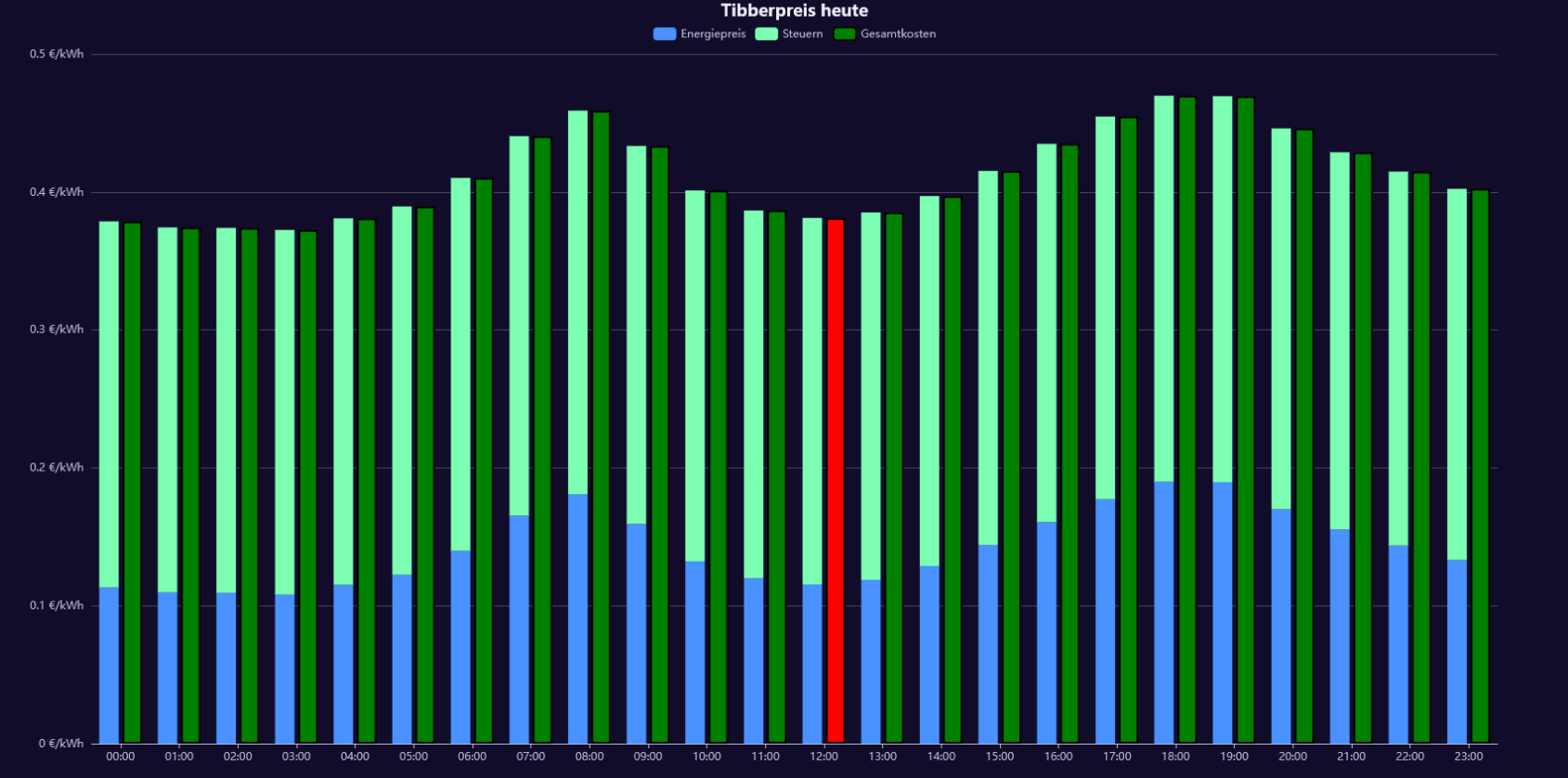
-
@m-a-hueb Top! Würde mich freuen, wenn Du es auch als Beitrag auf der flexcharts-Seite postest, also hier.
-
@jrbwh habs dort auch reingestellt
-
@m-a-hueb said in Test Adapter flexcharts - Stapeldiagramme und mehr:
hab hier mal 2 Charts gebaut. Dank geht an
Kann man die Farben der Balken auch verändern?
-
@icebear Die Farben der Balken ändert man bei der Definition der Datenreihen (series), z.B. so:
                    series: [{ name: "Consumption", type: "bar", color: "#ff0000", yAxisIndex: 0, data: []},
                             { name: "Cost",        type: "bar", color: "#00ff00", yAxisIndex: 1, data: []}]
Die Referenz zu Chart-Definitionen findest Du hier. Wenn Du da die Option "series" aufklappst, findest Du den Parameter "color".
-
@m-a-hueb sagte in Test Adapter flexcharts - Stapeldiagramme und mehr:
@merlin123 von dem hier:
//
// Create chart for Tibber data. To be used with flexcharts.
//
// Sample http request for hourly data chart:
// http://localhost:8082/flexcharts/echarts.html?source=script&message=tibber&chart=hourly
//

// Replace 'MY-TOKEN' with your own token:
const ID_TIBBER = 'tibberLink.0.Homes.MY-TOKEN.Consumption';

const IDS = { hourly:  '.jsonHourly',  // hourly data
              daily:   '.jsonDaily',   // daily data
              weekly:  '.jsonWeekly',  // weekly data
              monthly: '.jsonMonthly'  // monthly data
            };

onMessage('tibber', (httpParams, callback) => {
    // Use hourly data in case of invalid chart type
    const id = (httpParams.chart && httpParams.chart in IDS ? ID_TIBBER+IDS[httpParams.chart] : ID_TIBBER+IDS['hourly']);
    if (existsState(id)) {
        evalTibberData(httpParams.chart, id, result => callback(result));
    } else {
        console.log('Requested state is not available >>'+id+'<<');
        callback({title: { left: "center", textStyle: { color: "#ff0000" }, text: "REQUESTED STATE IS NOT AVAILABLE: >>" + id +"<<" }});
    }
});

function evalTibberData(myChart, id, callback) {
    const tibber = JSON.parse(getState(id).val);  // Read tibber data
    const chart = {
                    tooltip: { trigger: "axis", axisPointer: { type: "cross" }},
                    legend: { show: true, orient: "horizontal", left: "center", top: 25 },
                    title: { left: "center", text: "Tibber " },
                    grid: { right: "20%" },
                    toolbox: { feature: { dataView: { show: true, readOnly: false }, restore: { show: true }, saveAsImage: { show: true }}},
                    xAxis: [{ type: "category", axisTick: { alignWithLabel: true }, data: []}],
                    yAxis: [{ type: "value", position: "left",  alignTicks: true, axisLine: { show: true, lineStyle: { color: "#5470C6" }}, axisLabel: { formatter: "{value} kWh" }},
                            { type: "value", position: "right", alignTicks: true, axisLine: { show: true, lineStyle: { color: "#91CC75" }}, axisLabel: { formatter: "{value} €" }}],
                    series: [{ name: "Consumption", type: "bar", yAxisIndex: 0, data: []},
                             { name: "Cost",        type: "bar", yAxisIndex: 1, data: []}]
                   };
    const xAxis  = [];
    const yAxis0 = [];
    const yAxis1 = [];
    for (const data of Object.values(tibber)) {
        const isHourly = (myChart == 'hourly');  // Hourly data?
        const xValue = (isHourly ? new Date(data.from).toLocaleTimeString() : new Date(data.from).toLocaleDateString());
        xAxis.push(xValue);
        yAxis0.push((data.consumption ? data.consumption.toFixed(2) : 0));  // push 0 on null values
        yAxis1.push((data.cost ? data.cost.toFixed(2) : 0));                // push 0 on null values
    }
    chart.xAxis[0].data  = xAxis;       // Set chart x-axis data
    chart.series[0].data = yAxis0;      // Set chart y-values consumption
    chart.series[1].data = yAxis1;      // Set chart y-values cost
    chart.title.text += myChart;             // Add type of chart to title
    console.log('Evaluation of tibber '+myChart+' data done.');
    callback(chart);
}
Das ist nicht von mir
")
-
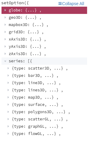
Nachdem ich mir nunmehr viele Wünsche mit deinem flexcharts-Adapter erfüllt habe - vielen Dank für diesen hervorragenden Adapter - habe ich gestern das neueste Update 3.2 installiert. Da wurde mir etwas à al echart-gl angezeigt. Ist diese Library mittlerweile in deinem Adapter integriert?
Mutig begab ich mich ans Testen und probierte das nachfolgende, einfache Chart aus ..
{
  "series": [{
    "type": "pie3D",
    "data": [
      45,20,56,80
    ],
    "depth": 45,
    "angle": 40
  }]
}
Leider erscheint keine Anzeige. Mache ich etwas falsch oder fehlt noch echart-gl?
-
@legro Ja, ab 0.3.1 werden 3D-Charts unterstützt. Probier mal diese Chart-Definition, die sollte funktionieren:
{"tooltip":{},"visualMap":{"min":1,"max":6,"dimension":2,"inRange":{"color":["#313695","#4575b4","#74add1","#abd9e9","#e0f3f8","#ffffbf","#fee090","#fdae61","#f46d43","#d73027"]}},"xAxis3D":{"type":"category","name":"AT (°C)"},"yAxis3D":{"type":"category","name":"VL (°C)"},"zAxis3D":{"type":"value","name":"COP"},"grid3D":{"boxWidth":100,"boxDepth":100,"viewControl":{"projection":"perspective"}},"series":[{"type":"scatter3D","symbolSize":10,"data":[[-10,35,3.43],[-10,40,3.18],[-10,45,2.92],[-10,50,2.65],[-10,55,2.37],[-10,60,2.08],[-10,65,1.78],[-8,35,3.67],[-8,40,3.42],[-8,45,3.15],[-8,50,2.88],[-8,55,2.6],[-8,60,2.31],[-8,65,2.01],[-6,35,3.92],[-6,40,3.67],[-6,45,3.4],[-6,50,3.13],[-6,55,2.85],[-6,60,2.56],[-6,65,2.26],[-4,35,4.18],[-4,40,3.93],[-4,45,3.67],[-4,50,3.4],[-4,55,3.12],[-4,60,2.83],[-4,65,2.53],[-2,35,4.44],[-2,40,4.19],[-2,45,3.92],[-2,50,3.65],[-2,55,3.37],[-2,60,3.08],[-2,65,2.78],[0,35,4.69],[0,40,4.44],[0,45,4.18],[0,50,3.91],[0,55,3.63],[0,60,3.34],[0,65,3.04],[2,35,4.95],[2,40,4.7],[2,45,4.43],[2,50,4.16],[2,55,3.88],[2,60,3.59],[2,65,3.29],[4,35,5.2],[4,40,4.95],[4,45,4.69],[4,50,4.42],[4,55,4.14],[4,60,3.85],[4,65,3.55],[6,35,5.44],[6,40,5.19],[6,45,4.93],[6,50,4.66],[6,55,4.38],[6,60,4.09],[6,65,3.79],[8,35,5.67],[8,40,5.42],[8,45,5.16],[8,50,4.89],[8,55,4.61],[8,60,4.32],[8,65,4.02],[10,35,5.89],[10,40,5.64],[10,45,5.38],[10,50,5.11],[10,55,4.83],[10,60,4.54],[10,65,4.24],[12,35,6.1],[12,40,5.85],[12,45,5.59],[12,50,5.32],[12,55,5.04],[12,60,4.75],[12,65,4.45],[14,35,6.29],[14,40,6.04],[14,45,5.78],[14,50,5.51],[14,55,5.23],[14,60,4.94],[14,65,4.64],[16,35,6.47],[16,40,6.22],[16,45,5.96],[16,50,5.69],[16,55,5.41],[16,60,5.12],[16,65,4.82],[18,35,6.63],[18,40,6.38],[18,45,6.12],[18,50,5.85],[18,55,5.57],[18,60,5.28],[18,65,4.98],[20,35,6.78],[20,40,6.53],[20,45,6.27],[20,50,6],[20,55,5.72],[20,60,5.43],[20,65,5.13]]}]} -
Beeindruckend!

Meine bisher gepflegte Strategie: Ganz klein anfangen! Ich möchte Stück für Stück jeden Schritt verstehen. Nur so kann ich dann hoffentlich irgendwann einmal meine Wünsche in die Tat umsetzen.
Aber meine Wünsche sind noch viel bescheidener. Was ist an meinem Beispiel wohlmöglich falsch?
-
@legro Ich finde in der Doku zu echart-gl keinen Typ "pie3D":
Wo hast Du das gefunden? -
Das Beispiel hatte noch weitere Optionen, aber diese betrafen nicht die 3D-Darstellung. Daher hatte ich diese im obigen Beitrag weggelassen.
Leider finde ich die Stelle (auch) nicht mehr.
 Weiß der Teufel, wo das war. Das einzige, was ich derzeit finde, ist die Aussage, dass derzeit ECharts wohl doch noch keine 3D Pie Charts beherrscht. Schade.
 -
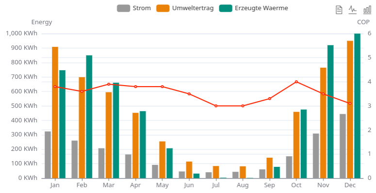
Ich hab auch noch eine Frage und zwar wollte ich diese Chart anzeigen lassen, aber egal was ich mache die Seite bleibt einfach weiß.
Ich habs mal so hier gepostet wie ich es bei den Examples zusammengebaut hab.
Alle anderen Chart's bei mir funktionieren
option = {
  tooltip: {
    trigger: 'axis',
    axisPointer: {
      type: 'cross',
      crossStyle: {
        color: '#999'
      }
    }
  },
  toolbox: {
    feature: {
      dataView: { show: true, readOnly: false },
      magicType: { show: true, type: ['line', 'bar'] },
      restore: { show: true },
      saveAsImage: { show: true }
    }
  },
  legend: {
    data: ['Strom', 'Umweltertrag', 'Erzeugte Waerme']
  },
  xAxis: [
    {
      type: 'category',
      axisTick: {
        alignWithLabel: true
      },
      // prettier-ignore
      data: ['Jan', 'Feb', 'Mar', 'Apr', 'May', 'Jun', 'Jul', 'Aug', 'Sep', 'Oct', 'Nov', 'Dec']
    }
  ],
  yAxis: [
    {
      type: 'value',
      name: 'Energy',
      min: 0,
      max: 1000,
      interval: 100,
      axisLabel: {
        formatter: '{value} KWh'
      }
    },
    {
      type: 'value',
      name: 'COP',
      min: 0,
      max: 6,
      interval: 1,
      axisLabel: {
        formatter: '{value}'
      }
    }
  ],
  series: [
    {
      name: 'Strom',
      type: 'bar',
      color: '#999999',
      data: [
        323.4,
        260,
        207,
        164,
        92,
        46.5,
        41,
        44,
        61,
        151.4,
        308.6,
        444
      ]
    },
    {
      name: 'Umweltertrag',
      type: 'bar',
      color: '#ea8109',
      data: [
        908.3,
        698.6,
        594.7,
        452.1,
        254.3,
        115.1,
        84.1,
        82.2,
        141.9,
        458.8,
        764.5,
        950
      ]
    },
    {
      name: 'Erzeugte Waerme',
      type: 'bar',
      color: '#028F7E',
      data: [
        746.7,
        849.7,
        660.5,
        463.6,
        206.8,
        31.9,
        3.4,
        2.2,
        78.5,
        474.8,
        920,
        1201
      ]
    },
    {
      name: 'COP',
      type: 'line',
      color: '#ff2c0a',
      yAxisIndex: 1,
      data: [
        3.8,
        3.6,
        3.9,
        3.8,
        3.8,
        3.5,
        3.0,
        3.0,
        3.3,
        4.0,
        3.5,
        3.1
      ]
    }
  ]
};
was mach ich falsch?
-
@icebear Schwer zu sagen, bei mir funktioniert es:
Vielleicht hilft es, wenn Du im Browser F12 drückst, dann "Konsole" auswählst und die Seite neu lädst. Da werden Log-Einträge und Fehlermeldungen des Browser angezeigt. -
Ich hab den Fehler gefunden, da hat sich eine '{' dazwischen gemogelt, die hatte ich übersehen.
Trotzdem Danke für deinen Hinweis.
-
@icebear Tja, sind meistens die einfachen Dinge. Noch ein Hinweis: Mit "alignTicks: true" kann man dafür sorgen, dass die beiden Achsen-Ticks aufeinander ausgerichtet werden. Der Max.-Wert der linken Achse sollte dann aber durch 6 teilbar sein. Z.B. so:
yAxis: [ { type: 'value', name: 'Energy', alignTicks: true, min: 0, max: 1500, axisLabel: { formatter: '{value} KWh' } }, { type: 'value', name: 'COP', min: 0, max: 6, axisLabel: { formatter: '{value}' } } ], -
Super Tipp, Danke

-
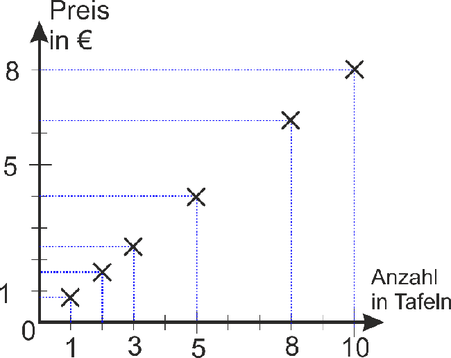
Kann man eigentlich irgendwie die Einheiten an die Achsen schreiben, und zwar nicht hinter jeden Wert sondern am Ende der Achse?
Also wo in der Art wie in dem Bild (nur als zufälliges Beispiel)
-
meinst du da wo bei dir "Preis in €" und " Anzahl in Tafeln" steht ?
dann probier es mal damit:
  "yAxis": [
    {
      "name": "Energien",
      "nameLocation": "end",
      "nameTextStyle": {
        "color": "#ffffff",
        "fontSize": 15
      },
und das gleiche dann halt auch bei der xAchse eintragen.
-
@merlin123 sagte in Test Adapter flexcharts - Stapeldiagramme und mehr:
Kann man eigentlich irgendwie ..
Ideen zu dem, was man so alles machen und wie man sich in deren Erstellung einfinden kann, findest du u.a. hier. Eines dieser Diagramme wird in diesem Beitrag näher beschrieben.
-
@legro Ah Dank Dir! Da hab ich den relevanten Teil gefunden
")
