
CSS Training
-
Wie in Facebook versprochen hier das CSS Trainings für alle.
Part 1
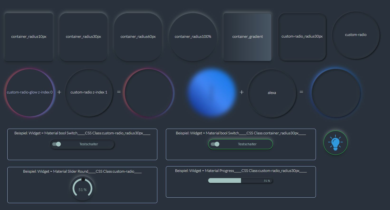
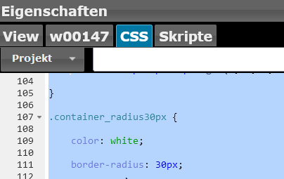
CSS Code
/*Import der google Schriftart Lato*/

@import url('https://fonts.googleapis.com/css2?family=Lato:wght@100;300;700&display=swap');

/*Import der google Schriftart Lato_end*/


/*eigener Hintergrund*/
.vis-view {
    background: #29323C;
    color: #ffffff;
    font-family: "Lato", sans-serif;
}


.input {
    font-size: 16px;
    border-radius: 8px;
    border: 1px solid #b5d4ff;
    color: white;
    outline-color: #236eb9;
}


/*container*/

.container_radius10px {
    color: white;
    border-radius: 10px;
    box-shadow: 0 1px 1px rgba(0, 0, 0, 0.11), 0 2px 2px rgba(0, 0, 0, 0.11), 0 4px 4px rgba(0, 0, 0, 0.11), 0 6px 8px rgba(0, 0, 0, 0.11), 0 8px 16px rgba(0, 0, 0, 0.11), 0 -6px 8px rgba(255, 255, 255, 0.11), 0 -8px 16px rgba(255, 255, 255, 0.11);
    border: 0.5px solid #29323C;
}

.container_radius30px {
    color: white;
    border-radius: 30px;
    box-shadow: 0 1px 1px rgba(0, 0, 0, 0.11), 0 2px 2px rgba(0, 0, 0, 0.11), 0 4px 4px rgba(0, 0, 0, 0.11), 0 6px 8px rgba(0, 0, 0, 0.11), 0 8px 16px rgba(0, 0, 0, 0.11), 0 -6px 8px rgba(255, 255, 255, 0.11), 0 -8px 16px rgba(255, 255, 255, 0.11);
    border: 0.5px solid #29323C;
}

.container_radius60px {
    color: white;
    border-radius: 60px;
    box-shadow: 0 1px 1px rgba(0, 0, 0, 0.11), 0 2px 2px rgba(0, 0, 0, 0.11), 0 4px 4px rgba(0, 0, 0, 0.11), 0 6px 8px rgba(0, 0, 0, 0.11), 0 8px 16px rgba(0, 0, 0, 0.11), 0 -6px 8px rgba(255, 255, 255, 0.11), 0 -8px 16px rgba(255, 255, 255, 0.11);
    border: 0.5px solid #29323C;
}


.container_radius100 {
    color: white;
    border-radius: 100%;
    box-shadow: 0 1px 1px rgba(0, 0, 0, 0.11), 0 2px 2px rgba(0, 0, 0, 0.11), 0 4px 4px rgba(0, 0, 0, 0.11), 0 6px 8px rgba(0, 0, 0, 0.11), 0 8px 16px rgba(0, 0, 0, 0.11), 0 -6px 8px rgba(255, 255, 255, 0.11), 0 -8px 16px rgba(255, 255, 255, 0.11);
    border: 0.5px solid #29323C;
}

.container_gradient {
    background-image: linear-gradient(270deg, #485563 0%, #29323C 100%);
    border-radius: 10px;
    border: 0.5px solid #29323C;
    box-shadow: 0 1px 1px rgba(0, 0, 0, 0.11), 0 2px 2px rgba(0, 0, 0, 0.11), 0 4px 4px rgba(0, 0, 0, 0.11), 0 6px 8px rgba(0, 0, 0, 0.11), 0 8px 16px rgba(0, 0, 0, 0.11), 0 -6px 8px rgba(255, 255, 255, 0.11), 0 -8px 16px rgba(255, 255, 255, 0.11);
}

/*container_end*/

/*custom-radio*/

.custom-radio {
    text-align: center;
    border-radius: 100px;
    border: none;
    box-shadow:
        -1px -1px 3px rgba(255, 255, 255, 0.1),
        2px 2px 6px rgba(0, 0, 0, 0.8),
        inset -2px -2px 10px rgba(255, 255, 255, 0.05),
        inset 2px 2px 10px rgba(0, 0, 0, 0.5);
}


.custom-radio-glow {
    border-radius: 100px;
    box-shadow:
        -1px -1px 3px rgba(255, 255, 255, 0.1),
        2px 2px 6px rgba(0, 0, 0, 0.8),
        inset -2px -2px 10px rgba(255, 255, 255, 0.05),
        inset 2px 2px 10px rgba(0, 0, 0, 0.5);
    animation: lightsbg 5s 750ms linear infinite;
}

@keyframes lightsbg {
    0% {
        color: hsl(230, 40%, 80%);
        box-shadow:
            0 0 1em hsla(320, 100%, 50%, 0.2),
            0 0 0.125em hsla(320, 100%, 60%, 0.3),
            -1em -0.125em 0.5em hsla(40, 100%, 60%, 0),
            1em 0.125em 0.5em hsla(200, 100%, 60%, 0);
    }

    30% {
        color: hsl(230, 80%, 90%);
        box-shadow:
            0 0 1em hsla(320, 100%, 50%, 0.5),
            0 0 0.125em hsla(320, 100%, 60%, 0.5),
            -0.5em -0.125em 0.25em hsla(40, 100%, 60%, 0.2),
            0.5em 0.125em 0.25em hsla(200, 100%, 60%, 0.4);
    }

    40% {
        color: hsl(230, 100%, 95%);
        box-shadow:
            0 0 1em hsla(320, 100%, 50%, 0.5),
            0 0 0.125em hsla(320, 100%, 90%, 0.5),
            -0.25em -0.125em 0.125em hsla(40, 100%, 60%, 0.2),
            0.25em 0.125em 0.125em hsla(200, 100%, 60%, 0.4);
    }

    70% {
        color: hsl(230, 80%, 90%);
        box-shadow:
            0 0 1em hsla(320, 100%, 50%, 0.5),
            0 0 0.125em hsla(320, 100%, 60%, 0.5),
            0.5em -0.125em 0.25em hsla(40, 100%, 60%, 0.2),
            -0.5em 0.125em 0.25em hsla(200, 100%, 60%, 0.4);
    }

    100% {
        color: hsl(230, 40%, 80%);
        box-shadow:
            0 0 1em hsla(320, 100%, 50%, 0.2),
            0 0 0.125em hsla(320, 100%, 60%, 0.3),
            1em -0.125em 0.5em hsla(40, 100%, 60%, 0),
            -1em 0.125em 0.5em hsla(200, 100%, 60%, 0);
    }
}

.custom-radio_radius30px {
    text-align: center;
    border-radius: 30px;
    box-shadow:
        -1px -1px 3px rgba(255, 255, 255, 0.1),
        2px 2px 6px rgba(0, 0, 0, 0.8),
        inset -2px -2px 10px rgba(255, 255, 255, 0.05),
        inset 2px 2px 10px rgba(0, 0, 0, 0.5);
}


.custom-radio__fortschritt {
    text-align: center;
    border-radius: 30px;
    box-shadow: inset -1px -1px 3px rgba(255, 255, 255, 0.1), inset 2px 2px 6px rgba(0, 0, 0, 0.8);
    box-shadow: inset 9px 9px 29px #151a1f,
        inset -9px -9px 29px #3d4a59;
}

/*custom-radio_end*/

/*alexa*/

.alexa {
    border-radius: 50%;
    background: #29323C;
    border: 2px solid #29323C;
    box-shadow:
        -1px -1px 3px rgba(255, 255, 255, 0.1),
        2px 2px 6px rgba(0, 0, 0, 0.8),
        inset -2px -2px 10px rgba(255, 255, 255, 0.05),
        inset 2px 2px 10px rgba(0, 0, 0, 0.5);
}

.alexaspan {
    border-radius: 50%;
    background-image: linear-gradient(-225deg,
            #021B79 0%,
            #4286f4 50%,
            #0575E6 100%);

    filter: blur(10px);
    z-index: -1;
    animation: animate 1.5s linear infinite;
}

@keyframes animate {
    0% {
        transform: rotate(0deg);
    }

    100% {
        transform: rotate(360deg);
    }
}

/*alexa_end*/
Projekt zum importieren
2022-01-13-main.zip -
Wie in Facebook versprochen hier das CSS Trainings für alle.
Part 1
CSS Code
/*Import der google Schriftart Lato*/

@import url('https://fonts.googleapis.com/css2?family=Lato:wght@100;300;700&display=swap');

/*Import der google Schriftart Lato_end*/


/*eigener Hintergrund*/
.vis-view {
    background: #29323C;
    color: #ffffff;
    font-family: "Lato", sans-serif;
}


.input {
    font-size: 16px;
    border-radius: 8px;
    border: 1px solid #b5d4ff;
    color: white;
    outline-color: #236eb9;
}


/*container*/

.container_radius10px {
    color: white;
    border-radius: 10px;
    box-shadow: 0 1px 1px rgba(0, 0, 0, 0.11), 0 2px 2px rgba(0, 0, 0, 0.11), 0 4px 4px rgba(0, 0, 0, 0.11), 0 6px 8px rgba(0, 0, 0, 0.11), 0 8px 16px rgba(0, 0, 0, 0.11), 0 -6px 8px rgba(255, 255, 255, 0.11), 0 -8px 16px rgba(255, 255, 255, 0.11);
    border: 0.5px solid #29323C;
}

.container_radius30px {
    color: white;
    border-radius: 30px;
    box-shadow: 0 1px 1px rgba(0, 0, 0, 0.11), 0 2px 2px rgba(0, 0, 0, 0.11), 0 4px 4px rgba(0, 0, 0, 0.11), 0 6px 8px rgba(0, 0, 0, 0.11), 0 8px 16px rgba(0, 0, 0, 0.11), 0 -6px 8px rgba(255, 255, 255, 0.11), 0 -8px 16px rgba(255, 255, 255, 0.11);
    border: 0.5px solid #29323C;
}

.container_radius60px {
    color: white;
    border-radius: 60px;
    box-shadow: 0 1px 1px rgba(0, 0, 0, 0.11), 0 2px 2px rgba(0, 0, 0, 0.11), 0 4px 4px rgba(0, 0, 0, 0.11), 0 6px 8px rgba(0, 0, 0, 0.11), 0 8px 16px rgba(0, 0, 0, 0.11), 0 -6px 8px rgba(255, 255, 255, 0.11), 0 -8px 16px rgba(255, 255, 255, 0.11);
    border: 0.5px solid #29323C;
}


.container_radius100 {
    color: white;
    border-radius: 100%;
    box-shadow: 0 1px 1px rgba(0, 0, 0, 0.11), 0 2px 2px rgba(0, 0, 0, 0.11), 0 4px 4px rgba(0, 0, 0, 0.11), 0 6px 8px rgba(0, 0, 0, 0.11), 0 8px 16px rgba(0, 0, 0, 0.11), 0 -6px 8px rgba(255, 255, 255, 0.11), 0 -8px 16px rgba(255, 255, 255, 0.11);
    border: 0.5px solid #29323C;
}

.container_gradient {
    background-image: linear-gradient(270deg, #485563 0%, #29323C 100%);
    border-radius: 10px;
    border: 0.5px solid #29323C;
    box-shadow: 0 1px 1px rgba(0, 0, 0, 0.11), 0 2px 2px rgba(0, 0, 0, 0.11), 0 4px 4px rgba(0, 0, 0, 0.11), 0 6px 8px rgba(0, 0, 0, 0.11), 0 8px 16px rgba(0, 0, 0, 0.11), 0 -6px 8px rgba(255, 255, 255, 0.11), 0 -8px 16px rgba(255, 255, 255, 0.11);
}

/*container_end*/

/*custom-radio*/

.custom-radio {
    text-align: center;
    border-radius: 100px;
    border: none;
    box-shadow:
        -1px -1px 3px rgba(255, 255, 255, 0.1),
        2px 2px 6px rgba(0, 0, 0, 0.8),
        inset -2px -2px 10px rgba(255, 255, 255, 0.05),
        inset 2px 2px 10px rgba(0, 0, 0, 0.5);
}


.custom-radio-glow {
    border-radius: 100px;
    box-shadow:
        -1px -1px 3px rgba(255, 255, 255, 0.1),
        2px 2px 6px rgba(0, 0, 0, 0.8),
        inset -2px -2px 10px rgba(255, 255, 255, 0.05),
        inset 2px 2px 10px rgba(0, 0, 0, 0.5);
    animation: lightsbg 5s 750ms linear infinite;
}

@keyframes lightsbg {
    0% {
        color: hsl(230, 40%, 80%);
        box-shadow:
            0 0 1em hsla(320, 100%, 50%, 0.2),
            0 0 0.125em hsla(320, 100%, 60%, 0.3),
            -1em -0.125em 0.5em hsla(40, 100%, 60%, 0),
            1em 0.125em 0.5em hsla(200, 100%, 60%, 0);
    }

    30% {
        color: hsl(230, 80%, 90%);
        box-shadow:
            0 0 1em hsla(320, 100%, 50%, 0.5),
            0 0 0.125em hsla(320, 100%, 60%, 0.5),
            -0.5em -0.125em 0.25em hsla(40, 100%, 60%, 0.2),
            0.5em 0.125em 0.25em hsla(200, 100%, 60%, 0.4);
    }

    40% {
        color: hsl(230, 100%, 95%);
        box-shadow:
            0 0 1em hsla(320, 100%, 50%, 0.5),
            0 0 0.125em hsla(320, 100%, 90%, 0.5),
            -0.25em -0.125em 0.125em hsla(40, 100%, 60%, 0.2),
            0.25em 0.125em 0.125em hsla(200, 100%, 60%, 0.4);
    }

    70% {
        color: hsl(230, 80%, 90%);
        box-shadow:
            0 0 1em hsla(320, 100%, 50%, 0.5),
            0 0 0.125em hsla(320, 100%, 60%, 0.5),
            0.5em -0.125em 0.25em hsla(40, 100%, 60%, 0.2),
            -0.5em 0.125em 0.25em hsla(200, 100%, 60%, 0.4);
    }

    100% {
        color: hsl(230, 40%, 80%);
        box-shadow:
            0 0 1em hsla(320, 100%, 50%, 0.2),
            0 0 0.125em hsla(320, 100%, 60%, 0.3),
            1em -0.125em 0.5em hsla(40, 100%, 60%, 0),
            -1em 0.125em 0.5em hsla(200, 100%, 60%, 0);
    }
}

.custom-radio_radius30px {
    text-align: center;
    border-radius: 30px;
    box-shadow:
        -1px -1px 3px rgba(255, 255, 255, 0.1),
        2px 2px 6px rgba(0, 0, 0, 0.8),
        inset -2px -2px 10px rgba(255, 255, 255, 0.05),
        inset 2px 2px 10px rgba(0, 0, 0, 0.5);
}


.custom-radio__fortschritt {
    text-align: center;
    border-radius: 30px;
    box-shadow: inset -1px -1px 3px rgba(255, 255, 255, 0.1), inset 2px 2px 6px rgba(0, 0, 0, 0.8);
    box-shadow: inset 9px 9px 29px #151a1f,
        inset -9px -9px 29px #3d4a59;
}

/*custom-radio_end*/

/*alexa*/

.alexa {
    border-radius: 50%;
    background: #29323C;
    border: 2px solid #29323C;
    box-shadow:
        -1px -1px 3px rgba(255, 255, 255, 0.1),
        2px 2px 6px rgba(0, 0, 0, 0.8),
        inset -2px -2px 10px rgba(255, 255, 255, 0.05),
        inset 2px 2px 10px rgba(0, 0, 0, 0.5);
}

.alexaspan {
    border-radius: 50%;
    background-image: linear-gradient(-225deg,
            #021B79 0%,
            #4286f4 50%,
            #0575E6 100%);

    filter: blur(10px);
    z-index: -1;
    animation: animate 1.5s linear infinite;
}

@keyframes animate {
    0% {
        transform: rotate(0deg);
    }

    100% {
        transform: rotate(360deg);
    }
}

/*alexa_end*/
Projekt zum importieren
2022-01-13-main.zipWarum wiederholst du bei container_radius immer alles?
reicht da nicht eine container klasse und 3 oder 4 radius klassen, die nur den radius jeweils definieren?
bei custom-radio/glow auch.container_radius{ color: white; box-shadow: 0 1px 1px rgba(0, 0, 0, 0.11), 0 2px 2px rgba(0, 0, 0, 0.11), 0 4px 4px rgba(0, 0, 0, 0.11), 0 6px 8px rgba(0, 0, 0, 0.11), 0 8px 16px rgba(0, 0, 0, 0.11), 0 -6px 8px rgba(255, 255, 255, 0.11), 0 -8px 16px rgba(255, 255, 255, 0.11); border: 0.5px solid #29323C; } .container_radius10px { border-radius: 30px; } .container_radius30px { border-radius: 30px; }als css klasse kann man dann die beiden kombinieren
<div class="container_radius container_radius10px"></div>
<div class="container_radius container_radius30px"></div>
und die Namen noch kürzen
das macht css etwas pflegeleichter und man muss die selben parameter bei Änderung nicht an mehreren Stellen pflegen
Meine Adapter und Widgets
TVProgram, SqueezeboxRPC, OpenLiga, RSSFeed, MyTime,, pi-hole2, vis-json-template, skiinfo, vis-mapwidgets, vis-2-widgets-rssfeed
Links im Profil -
Wie in Facebook versprochen hier das CSS Trainings für alle.
Part 1
CSS Code
/*Import der google Schriftart Lato*/

@import url('https://fonts.googleapis.com/css2?family=Lato:wght@100;300;700&display=swap');

/*Import der google Schriftart Lato_end*/


/*eigener Hintergrund*/
.vis-view {
    background: #29323C;
    color: #ffffff;
    font-family: "Lato", sans-serif;
}


.input {
    font-size: 16px;
    border-radius: 8px;
    border: 1px solid #b5d4ff;
    color: white;
    outline-color: #236eb9;
}


/*container*/

.container_radius10px {
    color: white;
    border-radius: 10px;
    box-shadow: 0 1px 1px rgba(0, 0, 0, 0.11), 0 2px 2px rgba(0, 0, 0, 0.11), 0 4px 4px rgba(0, 0, 0, 0.11), 0 6px 8px rgba(0, 0, 0, 0.11), 0 8px 16px rgba(0, 0, 0, 0.11), 0 -6px 8px rgba(255, 255, 255, 0.11), 0 -8px 16px rgba(255, 255, 255, 0.11);
    border: 0.5px solid #29323C;
}

.container_radius30px {
    color: white;
    border-radius: 30px;
    box-shadow: 0 1px 1px rgba(0, 0, 0, 0.11), 0 2px 2px rgba(0, 0, 0, 0.11), 0 4px 4px rgba(0, 0, 0, 0.11), 0 6px 8px rgba(0, 0, 0, 0.11), 0 8px 16px rgba(0, 0, 0, 0.11), 0 -6px 8px rgba(255, 255, 255, 0.11), 0 -8px 16px rgba(255, 255, 255, 0.11);
    border: 0.5px solid #29323C;
}

.container_radius60px {
    color: white;
    border-radius: 60px;
    box-shadow: 0 1px 1px rgba(0, 0, 0, 0.11), 0 2px 2px rgba(0, 0, 0, 0.11), 0 4px 4px rgba(0, 0, 0, 0.11), 0 6px 8px rgba(0, 0, 0, 0.11), 0 8px 16px rgba(0, 0, 0, 0.11), 0 -6px 8px rgba(255, 255, 255, 0.11), 0 -8px 16px rgba(255, 255, 255, 0.11);
    border: 0.5px solid #29323C;
}


.container_radius100 {
    color: white;
    border-radius: 100%;
    box-shadow: 0 1px 1px rgba(0, 0, 0, 0.11), 0 2px 2px rgba(0, 0, 0, 0.11), 0 4px 4px rgba(0, 0, 0, 0.11), 0 6px 8px rgba(0, 0, 0, 0.11), 0 8px 16px rgba(0, 0, 0, 0.11), 0 -6px 8px rgba(255, 255, 255, 0.11), 0 -8px 16px rgba(255, 255, 255, 0.11);
    border: 0.5px solid #29323C;
}

.container_gradient {
    background-image: linear-gradient(270deg, #485563 0%, #29323C 100%);
    border-radius: 10px;
    border: 0.5px solid #29323C;
    box-shadow: 0 1px 1px rgba(0, 0, 0, 0.11), 0 2px 2px rgba(0, 0, 0, 0.11), 0 4px 4px rgba(0, 0, 0, 0.11), 0 6px 8px rgba(0, 0, 0, 0.11), 0 8px 16px rgba(0, 0, 0, 0.11), 0 -6px 8px rgba(255, 255, 255, 0.11), 0 -8px 16px rgba(255, 255, 255, 0.11);
}

/*container_end*/

/*custom-radio*/

.custom-radio {
    text-align: center;
    border-radius: 100px;
    border: none;
    box-shadow:
        -1px -1px 3px rgba(255, 255, 255, 0.1),
        2px 2px 6px rgba(0, 0, 0, 0.8),
        inset -2px -2px 10px rgba(255, 255, 255, 0.05),
        inset 2px 2px 10px rgba(0, 0, 0, 0.5);
}


.custom-radio-glow {
    border-radius: 100px;
    box-shadow:
        -1px -1px 3px rgba(255, 255, 255, 0.1),
        2px 2px 6px rgba(0, 0, 0, 0.8),
        inset -2px -2px 10px rgba(255, 255, 255, 0.05),
        inset 2px 2px 10px rgba(0, 0, 0, 0.5);
    animation: lightsbg 5s 750ms linear infinite;
}

@keyframes lightsbg {
    0% {
        color: hsl(230, 40%, 80%);
        box-shadow:
            0 0 1em hsla(320, 100%, 50%, 0.2),
            0 0 0.125em hsla(320, 100%, 60%, 0.3),
            -1em -0.125em 0.5em hsla(40, 100%, 60%, 0),
            1em 0.125em 0.5em hsla(200, 100%, 60%, 0);
    }

    30% {
        color: hsl(230, 80%, 90%);
        box-shadow:
            0 0 1em hsla(320, 100%, 50%, 0.5),
            0 0 0.125em hsla(320, 100%, 60%, 0.5),
            -0.5em -0.125em 0.25em hsla(40, 100%, 60%, 0.2),
            0.5em 0.125em 0.25em hsla(200, 100%, 60%, 0.4);
    }

    40% {
        color: hsl(230, 100%, 95%);
        box-shadow:
            0 0 1em hsla(320, 100%, 50%, 0.5),
            0 0 0.125em hsla(320, 100%, 90%, 0.5),
            -0.25em -0.125em 0.125em hsla(40, 100%, 60%, 0.2),
            0.25em 0.125em 0.125em hsla(200, 100%, 60%, 0.4);
    }

    70% {
        color: hsl(230, 80%, 90%);
        box-shadow:
            0 0 1em hsla(320, 100%, 50%, 0.5),
            0 0 0.125em hsla(320, 100%, 60%, 0.5),
            0.5em -0.125em 0.25em hsla(40, 100%, 60%, 0.2),
            -0.5em 0.125em 0.25em hsla(200, 100%, 60%, 0.4);
    }

    100% {
        color: hsl(230, 40%, 80%);
        box-shadow:
            0 0 1em hsla(320, 100%, 50%, 0.2),
            0 0 0.125em hsla(320, 100%, 60%, 0.3),
            1em -0.125em 0.5em hsla(40, 100%, 60%, 0),
            -1em 0.125em 0.5em hsla(200, 100%, 60%, 0);
    }
}

.custom-radio_radius30px {
    text-align: center;
    border-radius: 30px;
    box-shadow:
        -1px -1px 3px rgba(255, 255, 255, 0.1),
        2px 2px 6px rgba(0, 0, 0, 0.8),
        inset -2px -2px 10px rgba(255, 255, 255, 0.05),
        inset 2px 2px 10px rgba(0, 0, 0, 0.5);
}


.custom-radio__fortschritt {
    text-align: center;
    border-radius: 30px;
    box-shadow: inset -1px -1px 3px rgba(255, 255, 255, 0.1), inset 2px 2px 6px rgba(0, 0, 0, 0.8);
    box-shadow: inset 9px 9px 29px #151a1f,
        inset -9px -9px 29px #3d4a59;
}

/*custom-radio_end*/

/*alexa*/

.alexa {
    border-radius: 50%;
    background: #29323C;
    border: 2px solid #29323C;
    box-shadow:
        -1px -1px 3px rgba(255, 255, 255, 0.1),
        2px 2px 6px rgba(0, 0, 0, 0.8),
        inset -2px -2px 10px rgba(255, 255, 255, 0.05),
        inset 2px 2px 10px rgba(0, 0, 0, 0.5);
}

.alexaspan {
    border-radius: 50%;
    background-image: linear-gradient(-225deg,
            #021B79 0%,
            #4286f4 50%,
            #0575E6 100%);

    filter: blur(10px);
    z-index: -1;
    animation: animate 1.5s linear infinite;
}

@keyframes animate {
    0% {
        transform: rotate(0deg);
    }

    100% {
        transform: rotate(360deg);
    }
}

/*alexa_end*/
Projekt zum importieren
2022-01-13-main.zip@enrico-fischer
Vielen Dank für deine Mühe
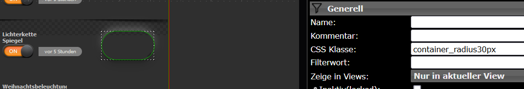
Ich habe mir dein Projekt importiert und mal mit einer Lampe von mir VerknüpftLeider wird bei mir der grüne Schatten, wenn die Lampe an ist, nicht angezeigt
muss ich da noch irgendetwas einstellen? -
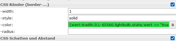
Du musst bin deinem Schalter in Ränder noch den Wert eingeben für True oder False.In dem unten angehängtem Code istballes drin.Du musst nur in das Feld mit dem XXXXX deinen Schalter angeben.
{wert:XXXXXXXXXXXXXXX;wert == "true" ? "#17e83b": ""}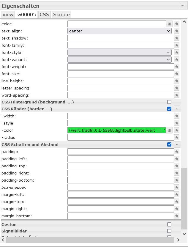
-
Warum wiederholst du bei container_radius immer alles?
reicht da nicht eine container klasse und 3 oder 4 radius klassen, die nur den radius jeweils definieren?
bei custom-radio/glow auch.container_radius{ color: white; box-shadow: 0 1px 1px rgba(0, 0, 0, 0.11), 0 2px 2px rgba(0, 0, 0, 0.11), 0 4px 4px rgba(0, 0, 0, 0.11), 0 6px 8px rgba(0, 0, 0, 0.11), 0 8px 16px rgba(0, 0, 0, 0.11), 0 -6px 8px rgba(255, 255, 255, 0.11), 0 -8px 16px rgba(255, 255, 255, 0.11); border: 0.5px solid #29323C; } .container_radius10px { border-radius: 30px; } .container_radius30px { border-radius: 30px; }als css klasse kann man dann die beiden kombinieren
<div class="container_radius container_radius10px"></div>
<div class="container_radius container_radius30px"></div>
und die Namen noch kürzen
das macht css etwas pflegeleichter und man muss die selben parameter bei Änderung nicht an mehreren Stellen pflegen
@oliverio Ja mach ich eigendlich auch. Ist nur etwas einfacher zu verstehen wenn sich ein Neuling damit beschäftigt.
-
@enrico-fischer
Beim linken Schalter
"Beispiel: Widget = Material bool Switch_____CSS Class:custom-radio_radius30px_____"
sehe ich auch keine Auswirkungen bei der Rand-Farbe (In deinem Demo-Video ebenfalls nicht).

Nichts desto trotz - sehr schön gemacht, vielen Dank!
-
-
@enrico-fischer
Beim linken Schalter
"Beispiel: Widget = Material bool Switch_____CSS Class:custom-radio_radius30px_____"
sehe ich auch keine Auswirkungen bei der Rand-Farbe (In deinem Demo-Video ebenfalls nicht).
Nichts desto trotz - sehr schön gemacht, vielen Dank!
@foodfighter beim linken ist der grüne rand auch nicht drin.
-
@foodfighter beim linken ist der grüne rand auch nicht drin.
@enrico-fischer
Ich habe das Projekt extra nochmal frisch importiert.
links ist der grüne Rand auch drin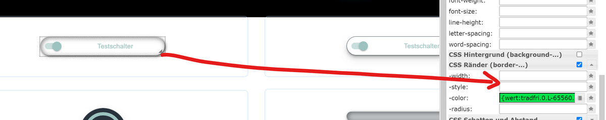
edit:
Ich hatte die Hoffnung, dass der ausgewaschene Rand dadurch die Farbe ändern würde :D -
@enrico-fischer
Ich habe das Projekt extra nochmal frisch importiert.
links ist der grüne Rand auch drinedit:
Ich hatte die Hoffnung, dass der ausgewaschene Rand dadurch die Farbe ändern würde :Dhast Recht.Mach bei Weite 1 und bei style Solid dann geht es wenn du deinen Adapter eingetragen hast
-
hast Recht.Mach bei Weite 1 und bei style Solid dann geht es wenn du deinen Adapter eingetragen hast
@enrico-fischer
danke -
Hi. Danke für dein Training.
Bin noch voll der noob was CSS angeht.Verstehe deine CSS soweit, aber ich würde gerne diesen Glow bei bei einem Widget haben wenn dies Aktiv ist. Nur da frage ich mich, was trage ich wo ein...
Könntest du/ihr mir dabei behilflich sein?
-
Hi. Danke für dein Training.
Bin noch voll der noob was CSS angeht.Verstehe deine CSS soweit, aber ich würde gerne diesen Glow bei bei einem Widget haben wenn dies Aktiv ist. Nur da frage ich mich, was trage ich wo ein...
Könntest du/ihr mir dabei behilflich sein?
-
@sebwirtz
Ich befasse mich auch gerade NEU mit dem Thema.
Zuerst befüllst du den CSS Reiter in deinem Projekt mit dem CSS Code.
Danach markierst Du ein Widget und vergibst in der CSS Klasse einen Verweis zu dem CSS Code.
Viele Grüße
-
@revobobo
Das habe ich alles gemacht. Aber das ändert mein Widget immer. Möchte gerne das der "glow" nur im aktiv bzw. True Fall erscheint.@sebwirtz sagte in CSS Training:
Möchte gerne das der "glow" nur im aktiv bzw. True Fall erscheint.
Das habe ich dir hier beschrieben , wo du dazu ein Thread erstellt hast zu deiner Frage :
https://forum.iobroker.net/topic/51563/widget-mit-animiertem-schatten-rand-css?loggedin=true
-
@sebwirtz
Ich befasse mich auch gerade NEU mit dem Thema.
Zuerst befüllst du den CSS Reiter in deinem Projekt mit dem CSS Code.
Danach markierst Du ein Widget und vergibst in der CSS Klasse einen Verweis zu dem CSS Code.
Viele Grüße
-
@revobobo hallo, gibt es ein widget oder css code für den tollen on/off switch?
LG
@juergen2304 said in CSS Training:
@revobobo hallo, gibt es ein widget oder css code für den tollen on/off switch?
LG
Ganz oben im ersten Post ist alles drin.
Hey! Du scheinst an dieser Unterhaltung interessiert zu sein, hast aber noch kein Konto.
Hast du es satt, bei jedem Besuch durch die gleichen Beiträge zu scrollen? Wenn du dich für ein Konto anmeldest, kommst du immer genau dorthin zurück, wo du zuvor warst, und kannst dich über neue Antworten benachrichtigen lassen (entweder per E-Mail oder Push-Benachrichtigung). Du kannst auch Lesezeichen speichern und Beiträge positiv bewerten, um anderen Community-Mitgliedern deine Wertschätzung zu zeigen.
Mit deinem Input könnte dieser Beitrag noch besser werden 💗
Registrieren AnmeldenSupport us
238
Online33.0k
Benutzer83.5k
Themen1.3m
Beiträge