
[Fun] vis-Editor im Material Design Style
-
Just for fun habe ich mal ein paar CSS Klassen geschrieben um den vis-Editor selbst ein neues, Material Design ähnliches, Kleid zu verpassen. Wer Spaß dran hat, kann die CSS Anweisungen unter "Eigenschaften | CSS | Global" bzw. "Eigenschaften | CSS | Projekt" einfügen. Der vis-Editor sieht dann so aus, sollte aber wie gewohnt funktionieren:
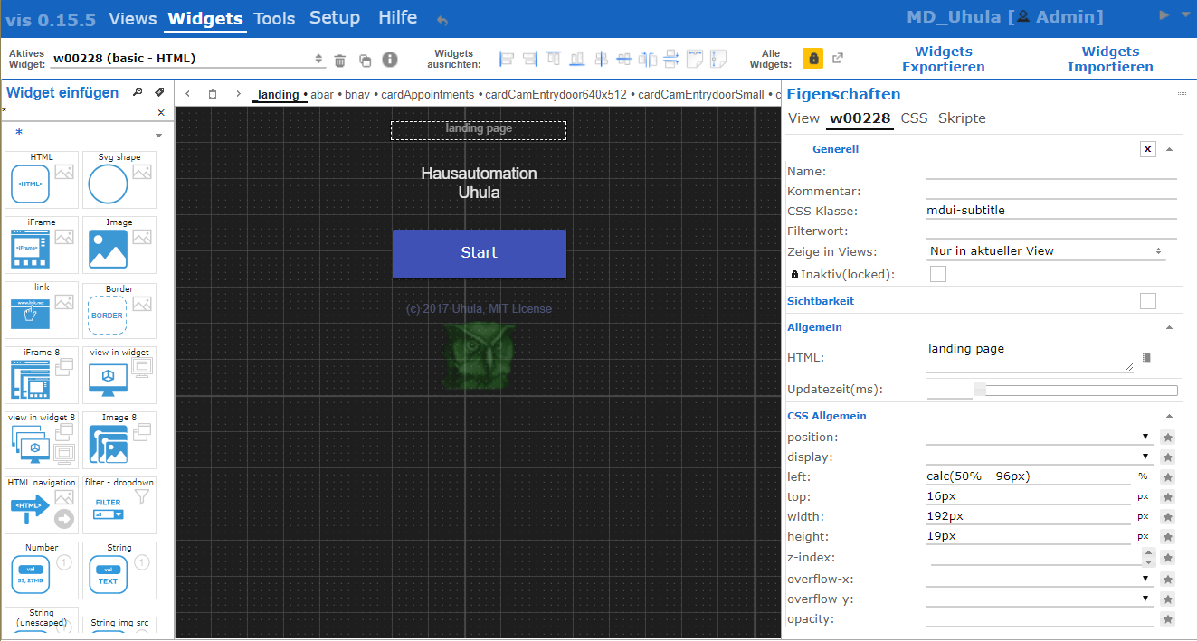
ve fun
CSS-Code:
! ````
/* -----
vis Editor im Material Design Style
V1.7 05.01.2018
o Anpassung an vis 1.0.4: Headlines der Dialoge*/
! /* mdui Hilfe im Hilfemenu mit anzeigen /
! #menu li:nth-child(2) ul:after {
position:absolute;
top:100%;
left:0px;
width:563px;
height:631px;
content:"";
background: #e0e0e0;
background-size: 555px 623px;
background-position: 4px 4px;
background-repeat: no-repeat;
background-image: url("https://github.com/Uhula/ioBroker-Material-Design-Style/blob/master/docs/mdui-uebersicht.png?raw=true");
border-radius:4px;
box-shadow: 0 0 0 1px rgba(255,255,255,0.025) inset, 0 3px 6px rgba(0,0,0,0.16), 0 3px 6px rgba(0,0,0,0.23);
}
! #attr_wrap table {
border-collapse: collapse;
}
#attr_wrap table .ui-state-default {
border: none;
}
! #attr_wrap td {
background:none !important;
color:#606060;
}
! .ui-widget-header,
#attr_wrap table tr:first-child td,
#attr_wrap .vis-inspect-group,
#attr_wrap .vis-inspect-group td,
#attr_wrap .css-inspector-heading {
background:none !important;
border:none;
color : #1976D2 !important;
font-weight: bolder !important;
font-size:0.95em !important;
}
! #attr_wrap>table tr:first-child td,
#attr_wrap .css-inspector-heading,
#attr_wrap .vis-inspect-group td {
border-top:1px solid #e0e0e0 !important;
padding-top:4px !important;
}
#attr_wrap tr>td:first-child {
border-left:1px solid #e0e0e0;
}
#attr_wrap tr:last-child>td {
border-bottom:1px solid #e0e0e0;
}
#attr_wrap tr>td.ui-widget-header {
display:none;
}
! #attr_wrap .vis-edit-td-caption {
background:transparent !important;
}
! #attr_wrap .ui-slider-horizontal {
height:6px;
background:#f0f0f0;
border-radius:0px;
border:none;
}
! #attr_wrap .ui-slider-handle {
background:#1976D2;
border-radius:50%;
}
! #view_select button,
#attr_wrap button {
background:none !important;
border:none !important;
color: #101010;
}
! #vis_wrap select+button,
#attr_wrap select+button {
border-bottom: 2px solid #d0d0d0 !important;
}
#vis_wrap select+button:hover,
#attr_wrap select+button:hover {
border-bottom-color: #FFC107 !important;
}
! #attr_wrap textarea,
#attr_wrap select,
#attr_wrap select+span,
#attr_wrap select+button,
#attr_wrap input {
border:none !important;
border-bottom: 2px solid #d0d0d0 !important;
}
! #attr_wrap textarea,
#attr_wrap select,
#attr_wrap select+span,
#attr_wrap select+button,
#attr_wrap input:not([style="color:"]) {
color: #101010;
background:transparent !important;
}
#attr_wrap textarea:focus,
#attr_wrap textarea:hover,
#attr_wrap select:focus,
#attr_wrap select:hover,
#attr_wrap select+span:hover,
#attr_wrap input:focus,
#attr_wrap input:hover{
border-bottom-color: #FFC107 !important;
}
#attr_wrap textarea:focus,
#attr_wrap select:focus,
#attr_wrap input:not([style*="color:"]):focus{
background-color:#FFF8E1 !important;
border-bottom-color: #FFC107 !important;
}
_#attr_wrap span {
background-color:transparent !important;
border:none !important;
}
! #attr_wrap #pan_attr>div:first-child {
background:none !important;
border:none !important;
color: #1976D2;
}
.ui-multiselect-checkboxes input[type="checkbox"],
#menu_body input[type="checkbox"],
#attr_wrap input[type="checkbox"] {
background:none !important;
border:none !important;
width:18px;
height:18px;
color: #101010;
}
.ui-multiselect-checkboxes input[type="checkbox"]:after,
#menu_body input[type="checkbox"]:after,
#attr_wrap input[type="checkbox"]:after {
background:white !important;
border:1px solid #c0c0c0 !important;
content:"";
display:block;
position:relative;
width:16px !important;
height:16px;
font-weight:bold;
cursor:pointer;
}
.ui-multiselect-checkboxes input[type="checkbox"]:checked:after,
#menu_body input[type="checkbox"]:checked:after,
#attr_wrap input[type="checkbox"]:checked:after {
content:"\00a0x";
}
.ui-multiselect-checkboxes input[type="checkbox"]:hover:after,
#menu_body input[type="checkbox"]:hover:after,
#attr_wrap input[type="checkbox"]:hover:after {
border:1px solid #FFC107 !important;
}
! .ace_gutter {
background:transparent !important;
border-right:1px solid #e0e0e0;
color:#a0a0a0 !important;
font-size:0.9em !important;
}
! .tab_attr {
border:none !important;
}
! .ui-widget-header li,
#vis_wrap .view-select-tab,
#menu_body li,
#attr_wrap li {
background:none !important;
border:none !important;
}
! #menu_body li.ui-state-active a,
#attr_wrap li.ui-state-active a {
border-bottom: 2px solid #101010 !important;
font-weight:bold;
}
! #vis_wrap .view-select-tab {
font-size:0.8em !important;
padding:0px !important;
padding-left:4px !important;
padding-right:4px !important;
margin:0 !important;
color:#606060;
}
#vis_wrap .view-select-tab.ui-state-active {
border-bottom: 2px solid #101010 !important;
font-weight:bold;
color:#101010;
}
! #menu_sf {
margin-bottom:0px !important;
}
! #menu_body,
#menu_body .vis-menu-line,
#menu_body .ui-widget-header {
background:#1565C0 !important;
border:none !important;
color:white;
}
! #menu_body td {
color:#606060;
}
! #pan_add_wid .ui-selectmenu-button,
#menu_body .ui-button {
background:transparent !important;
border:none !important;
font-weight:bold;
color: #1976D2;
border-radius:2px;
transform: scale(1);
font-size:14px;
}
! #pan_add_wid input,
#btn_prev_zoom,
#btn_prev_type,
#menu_body [class*="ui-selectmenu-button"],
#menu_body input,
#menu_body button,
#menu_body [class*="ribbon_tab"] div {
background:white !important;
border:none !important;
font-weight:bold;
color: #101010;
}
#pan_add_wid input,
#menu_body [class*="ui-selectmenu-button"],
#menu_body input,
#menu_body button {
border-bottom: 2px solid #c0c0c0 !important;
}
! #pan_add_wid input:hover,
#menu_body [class*="ui-selectmenu-button"]:hover,
#menu_body input:focus,
#menu_body input:active,
#menu_body input:hover,
#menu_body button:focus,
#menu_body button:active,
#menu_body button:hover {
border-bottom-color: #FFC107 !important;
}
! #menu_body img {
border:none !important;
border-radius:2px;
transform: scale(1.2);
}
#menu_body .ui-icon {
transform: scale(1.4);
}
! #menu_body li a {
opacity: 0.8;
color: white !important;
}
! #menu_body .menu-item a {
color: black !important;
}
! #menu_body li.ui-state-active a {
border-bottom: 3px solid white !important;
opacity: 1;
}
! html:not(.mdui-runtime) .ui-widget-header {
color:rgba(255,255,255,.4) !important;
}
! html:not(.mdui-runtime) .ui-dialog-titlebar.ui-widget-header {
background:#1976D2 !important;
}
! html:not(.mdui-runtime) .ui-widget-header li:hover,
#attr_wrap li:hover,
#btn_prev_zoom:hover,
#btn_prev_type:hover,
#vis_wrap .view-select-tab:hover,
#vis_wrap #view_select button:hover,
#menu_body a:hover,
#menu_body img:hover,
#menu_body div.ui-button:hover,
#menu_body .ui-button:hover {
box-shadow: 0px 0px 0px 1000px #FFC107 inset;
}
! #pan_add_wid>div {
background: transparent !important;
border:none !important;
}
! #pan_add_wid>div:first-child {
color: #1976D2;
}
! .wid-prev {
border-radius:0px !important;
margin:2px !important;
border: 1px solid #e0e0e0;
}
.wid-prev:hover {
border-color: #FFC107;
box-shadow: 0px 0px 0px 1000px #FFC107 inset;
}
! html:not(.mdui-runtime) .ui-state-hover,
html:not(.mdui-runtime) .ui-widget-content .ui-state-hover,
html:not(.mdui-runtime) .ui-widget-header .ui-state-hover,
html:not(.mdui-runtime) .ui-state-focus,
html:not(.mdui-runtime) .ui-widget-content
html:not(.mdui-runtime) .ui-state-focus,
html:not(.mdui-runtime) .ui-widget-header
html:not(.mdui-runtime) .ui-state-focus {
border-color: transparent;
background: none;
box-shadow: 0px 0px 0px 1000px #FFC107 inset;
}
! html:not(.mdui-runtime) #vis_container .ui-state-hover,
html:not(.mdui-runtime) #vis_container .ui-widget-content .ui-state-hover,
html:not(.mdui-runtime) #vis_container .ui-widget-header .ui-state-hover,
html:not(.mdui-runtime) #vis_container .ui-state-focus,
html:not(.mdui-runtime) #vis_container .ui-widget-content
html:not(.mdui-runtime) #vis_container .ui-state-focus,
html:not(.mdui-runtime) #vis_container .ui-widget-header
html:not(.mdui-runtime) #vis_container .ui-state-focus {
border-color: inherit;
background: inherit;
box-shadow: inherit;
}
! /* Scollbars (not Firefox, not IE) */
html:not(.mdui-runtime) ::-webkit-scrollbar-track {
box-shadow: inset 0 0 0 10px #ffffff;
}
! html:not(.mdui-runtime) ::-webkit-scrollbar {
width: 12px;
height: 12px;
}
! html:not(.mdui-runtime) ::-webkit-scrollbar-thumb {
border-radius: 4px;
background-color: #c0c0c0;
}
html:not(.mdui-runtime) ::-webkit-scrollbar-thumb:hover {
background-color: #FFC107;
}
! .wid-prev-k .wid-prev-content {
transform: scale(0.5);
padding-left:0px !important;
margin-left:0px !important;
}
! ````
<size size="85">Ohne Gewähr ;-)Edits:
2018-01-05 Anpassung: an vis 1.0.4: Headlines der Dialoge
2017-11-12 Anpassung: color-Eingabe behält Farbe
2017-11-08 Anpassung: Slider mit rundem Thumb, View-Tabs deutlicher getrennt</size>
-
ich habs auch direkt getestet.
Kriegst Du eventuell die einzelnen Reiter für die Views etwas deutlicher hin?
Ich hoffe du verstehst was ich meine.
:D
Edit: Nach einem Aktualisieren [F5] sind die Scrollbalken (z. B. bei aktiven Widgets, css der Widgets) zwar noch vorhanden, aber nicht mehr sichtbar. Zumindest bei mir nicht (Chrome)
-
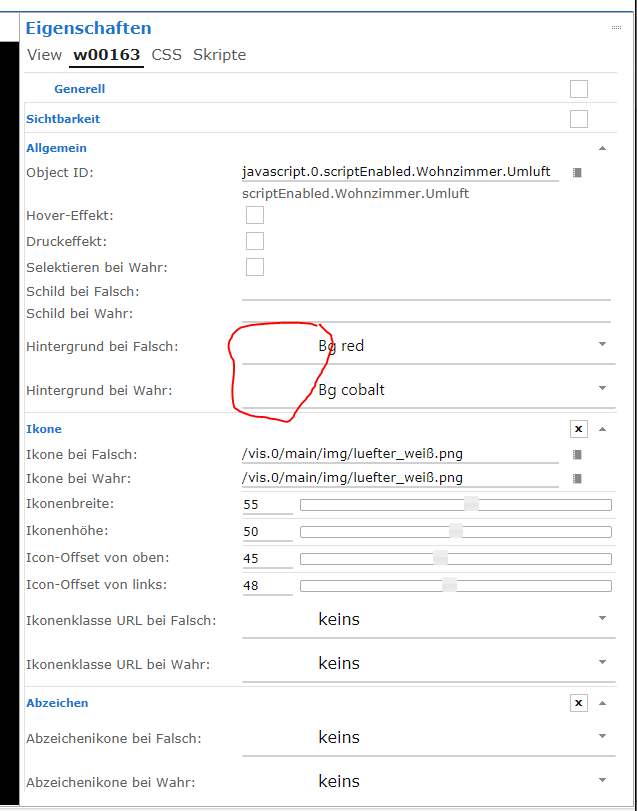
@Jey Cee:Neben dem fehlenden Scrollbalken ist mir bei den Metro Widgets noch aufgefallen das die Farb Vorschau fehlt, siehe Screenshot. `
Alle Änderungen sind im Code-Abschnitt im 1.Post dieses Themas eingepflegt:-
Scrollbars: werden, zumindest in webkit-Browsern (Chrome, Safari), gesetzt
-
Metro-Widgets: Farbangabe sichtbar
-
Slider: haben nun einen runden Thumb
-
Register-Tabs der Views: Entzerrt, nun deutlicher lesbar
-
-
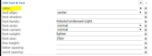
ok, sieht echt gut aus. Allerdings die Farbangaben im Css-Teil sind nicht sichtbar, nur wenn man mit der Maus darüberzieht.
(Siehe Bilder)
-
@Jey Cee:Das die farbangaben nicht zu sehen sind hab ich auch ohne das Material design.
Gesendet von Unterwegs `
Ohne Material design kann man aber den Text, zumindest bei mir, lesen.
Jetzt sieht das Feld so aus als ob es leer wäre.
Weißer Adler auf weißem Grund (ostfriesische Nationalflagge) :D
Edit: Aber keine Eile, auch so ist der Edit-Modus schon deutlich stylischer. Hut ab - Klasse Job
-
Ohne Material design kann man aber den Text, zumindest bei mir, lesen.
Jetzt sieht das Feld so aus als ob es leer wäre.
Weißer Adler auf weißem Grund (ostfriesische Nationalflagge) :D `
@Uhula - Könntest du eventuell nochmal schauen?
-
@Uhula - Könntest du eventuell nochmal schauen? `
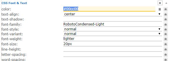
Klar.Ursache ist, dass in diesen Edits die color/background-color direkt im gesetzt sind um die Farbe auch darzustellen - das übersteuer ich mit den CSS Anweisungen. Es lässt sich im CSS aber leicht eine Ausnahme dafür einbauen (drei Stellen, jeweils den blauen Text ergänzen):
#attr_wrap textarea,
#attr_wrap select,
#attr_wrap select+span,
#attr_wrap select+button,
#attr_wrap input {
border:none !important;
border-bottom: 2px solid #d0d0d0 !important;
}
#attr_wrap textarea,
#attr_wrap select,
#attr_wrap select+span,
#attr_wrap select+button,
#attr_wrap input:not([style*="color:"]) {
color: #101010;
background:transparent !important;
}
#attr_wrap textarea:focus,
#attr_wrap select:focus,
#attr_wrap input:not([style*="color:"]):focus{
background-color:#FFF8E1 !important;
border-bottom-color: #FFC107 !important;
}
Oder die CSS aus dem 1.Post dieses Themas nutzen, habe es dort aktualisiert (in 2 min). Danke für den Hinweis.
-
Perfekt.
Hab es gerade geändert und jetzt funktioniert es perfekt.
1000 Dank
-
@dtp:Kleine Frage. Ich bekommen im CSS-Editor für die "!important;"-Einträge sehr viele Warnings angezeigt. Ist das normal? `
Ja, der Editor warnt generell bei der Verwendung von "!important".Info:
Die CSS-Anweisungen wurden im 1.Beitrag aktualisiert.
2018-01-05 Anpassung: an vis 1.0.4: Headlines der Dialoge (waren weiß)
Hey! Du scheinst an dieser Unterhaltung interessiert zu sein, hast aber noch kein Konto.
Hast du es satt, bei jedem Besuch durch die gleichen Beiträge zu scrollen? Wenn du dich für ein Konto anmeldest, kommst du immer genau dorthin zurück, wo du zuvor warst, und kannst dich über neue Antworten benachrichtigen lassen (entweder per E-Mail oder Push-Benachrichtigung). Du kannst auch Lesezeichen speichern und Beiträge positiv bewerten, um anderen Community-Mitgliedern deine Wertschätzung zu zeigen.
Mit deinem Input könnte dieser Beitrag noch besser werden 💗
Registrieren AnmeldenSupport us
414
Online32.9k
Benutzer83.0k
Themen1.3m
Beiträge