
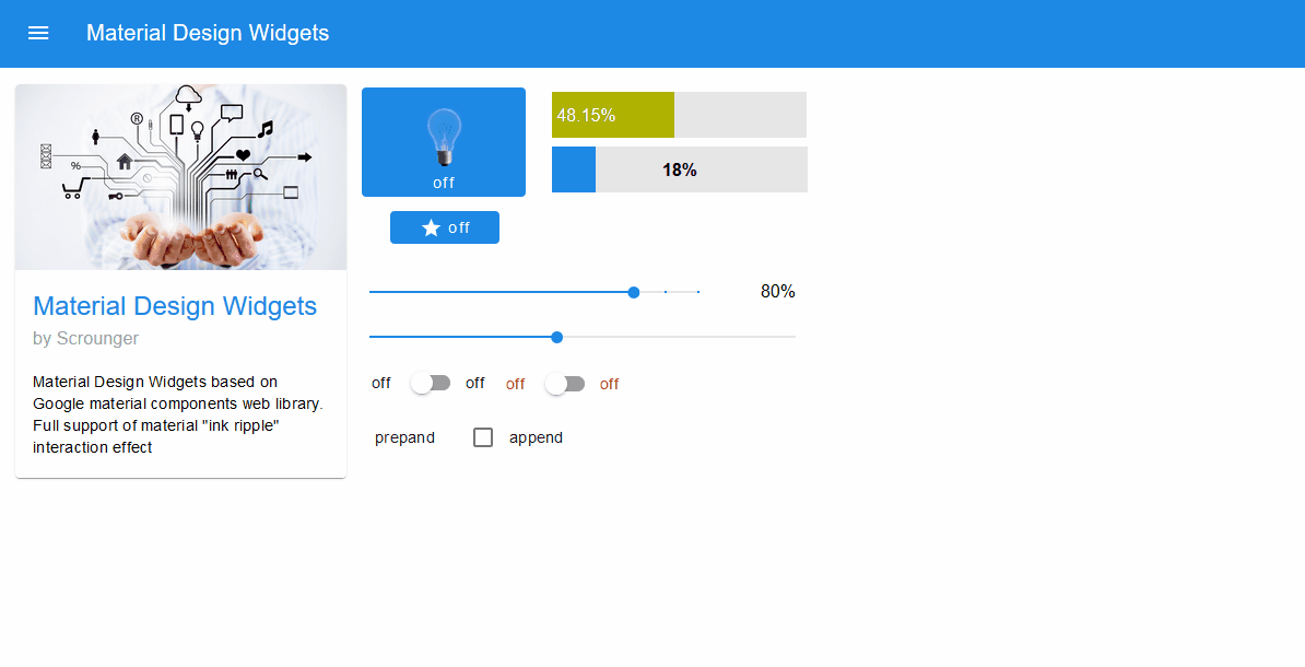
Material Design Widgets: Top App Bar Widget

-
gestern wurde mir die 0.5.5 angeboten.
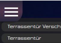
Läuft eigentlich alles, bis auf den Button (siehe Screenshot).Vorher war nur der runde Button zu sehen. Jetzt mit 0.5.5 ist es eckig mit dem runden in der Mitte.

-
@negalein
Hintergrund Farbe evtl transparent?
Hast du irgendwelche CSS uberscheibungen im Einsatz?@scrounger sagte in Material Design Widgets: Top App Bar Widget:
Hintergrund Farbe evtl transparent?
Nein
Hast du irgendwelche CSS uberscheibungen im Einsatz?
Ja, aber die hatte ich vor dem Update auch schon.
-
@negalein sagte in Material Design Widgets: Top App Bar Widget:
.... der runde Button zu sehen .... Jetzt ... ist es eckig
Dito ... ;)
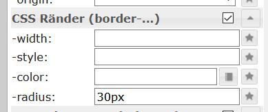
Du kannst es mit den Standarteinstellung beinflussen ..
.
Jede Ecke einzeln mit der Abrundung bestimmt :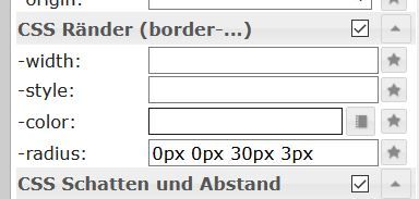
.
oder :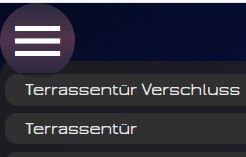
Synology 918+ 16GB - ioBroker in Docker v9 , VISO auf Trekstor Primebook C13 13,3" , Hikvision Domkameras mit Surveillance Station .. CCU RaspberryMatic in Synology VM .. Zigbee CC2538+CC2592 .. Sonoff .. KNX .. Modbus ..
-
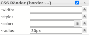
@negalein sagte in Material Design Widgets: Top App Bar Widget:
.... der runde Button zu sehen .... Jetzt ... ist es eckig
Dito ... ;)
Du kannst es mit den Standarteinstellung beinflussen ..
.
Jede Ecke einzeln mit der Abrundung bestimmt :
.
oder :@glasfaser sagte in Material Design Widgets: Top App Bar Widget:
Du kannst es mit den Standarteinstellung beinflussen .
leider nichts gebracht

° Node.js & System Update ---> sudo apt update, iob stop, sudo apt full-upgrade
° Node.js Fixer ---> iob nodejs-update
° Fixer ---> iob fix -
@glasfaser sagte in Material Design Widgets: Top App Bar Widget:
Du kannst es mit den Standarteinstellung beinflussen .
leider nichts gebracht
Du hast es aber im Widget TopAppBar geändert !?
Synology 918+ 16GB - ioBroker in Docker v9 , VISO auf Trekstor Primebook C13 13,3" , Hikvision Domkameras mit Surveillance Station .. CCU RaspberryMatic in Synology VM .. Zigbee CC2538+CC2592 .. Sonoff .. KNX .. Modbus ..
-
@glasfaser sagte in Material Design Widgets: Top App Bar Widget:
Du hast es aber im Widget TopAppBar geändert !?
Jep :)
° Node.js & System Update ---> sudo apt update, iob stop, sudo apt full-upgrade
° Node.js Fixer ---> iob nodejs-update
° Fixer ---> iob fix -
@glasfaser sagte in Material Design Widgets: Top App Bar Widget:
Du hast es aber im Widget TopAppBar geändert !?
Jep :)
Komisch ...
Nimm mal das Widget in einem anderen Projekt , ist es auch dort so das man es nicht verändern kann , bzw. nimm mal Testweise alle CSS Anweisungen raus . Global / Projekt
Synology 918+ 16GB - ioBroker in Docker v9 , VISO auf Trekstor Primebook C13 13,3" , Hikvision Domkameras mit Surveillance Station .. CCU RaspberryMatic in Synology VM .. Zigbee CC2538+CC2592 .. Sonoff .. KNX .. Modbus ..
-
Komisch ...
Nimm mal das Widget in einem anderen Projekt , ist es auch dort so das man es nicht verändern kann , bzw. nimm mal Testweise alle CSS Anweisungen raus . Global / Projekt
@glasfaser sagte in Material Design Widgets: Top App Bar Widget:
Nimm mal das Widget in einem anderen Projekt , ist es auch dort so das man es nicht verändern kann , bzw. nimm mal Testweise alle CSS Anweisungen raus . Global / Projekt
auch keine Änderung
Ich verstehs nicht
° Node.js & System Update ---> sudo apt update, iob stop, sudo apt full-upgrade
° Node.js Fixer ---> iob nodejs-update
° Fixer ---> iob fix -
@glasfaser sagte in Material Design Widgets: Top App Bar Widget:
Nimm mal das Widget in einem anderen Projekt , ist es auch dort so das man es nicht verändern kann , bzw. nimm mal Testweise alle CSS Anweisungen raus . Global / Projekt
auch keine Änderung
Ich verstehs nicht
Im Admin ... Adapter ... Upload durchführen bei
Material Design und VISSynology 918+ 16GB - ioBroker in Docker v9 , VISO auf Trekstor Primebook C13 13,3" , Hikvision Domkameras mit Surveillance Station .. CCU RaspberryMatic in Synology VM .. Zigbee CC2538+CC2592 .. Sonoff .. KNX .. Modbus ..
-
@glasfaser sagte in Material Design Widgets: Top App Bar Widget:
m Admin ... Adapter ... Upload durchführen bei
Material Design und VISNichts
Hab auch gerade den Vis-Adapter aktualisiert, Upload VIS, Upload Material (wie immer) brachte keine Änderung.
° Node.js & System Update ---> sudo apt update, iob stop, sudo apt full-upgrade
° Node.js Fixer ---> iob nodejs-update
° Fixer ---> iob fix -
@glasfaser sagte in Material Design Widgets: Top App Bar Widget:
m Admin ... Adapter ... Upload durchführen bei
Material Design und VISNichts
Hab auch gerade den Vis-Adapter aktualisiert, Upload VIS, Upload Material (wie immer) brachte keine Änderung.
schicke mir mal dein Widget zu
Synology 918+ 16GB - ioBroker in Docker v9 , VISO auf Trekstor Primebook C13 13,3" , Hikvision Domkameras mit Surveillance Station .. CCU RaspberryMatic in Synology VM .. Zigbee CC2538+CC2592 .. Sonoff .. KNX .. Modbus ..
-
@glasfaser sagte in Material Design Widgets: Top App Bar Widget:
schicke mir mal dein Widget zu
du hast Post
° Node.js & System Update ---> sudo apt update, iob stop, sudo apt full-upgrade
° Node.js Fixer ---> iob nodejs-update
° Fixer ---> iob fix -
@glasfaser sagte in Material Design Widgets: Top App Bar Widget:
schicke mir mal dein Widget zu
du hast Post
Synology 918+ 16GB - ioBroker in Docker v9 , VISO auf Trekstor Primebook C13 13,3" , Hikvision Domkameras mit Surveillance Station .. CCU RaspberryMatic in Synology VM .. Zigbee CC2538+CC2592 .. Sonoff .. KNX .. Modbus ..
-
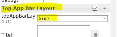
@glasfaser sagte in Material Design Widgets: Top App Bar Widget:
Stelle um auf :
Merci, das wars.
Hatte ich nicht mehr im Blick. -
hat jemand von Euch die 0.5.5 mit dem ipad4 ans laufen bekommen?
Die TopAppBar wird mir nicht mehr angezeigt über die iobrokerApp, auf dem Rechner funktioniert Sie allerdings ohne Probleme.@dqelse sagte in Material Design Widgets: Top App Bar Widget:
hat jemand von Euch die 0.5.5 mit dem ipad4 ans laufen bekommen?
...nicht mehr angezeigt über die iobrokerApp ...siehe https://github.com/Scrounger/ioBroker.vis-materialdesign#iobroker-vis-app, muss erst seitens app implementiert werden.
-
@dqelse sagte in Material Design Widgets: Top App Bar Widget:
hat jemand von Euch die 0.5.5 mit dem ipad4 ans laufen bekommen?
...nicht mehr angezeigt über die iobrokerApp ...siehe https://github.com/Scrounger/ioBroker.vis-materialdesign#iobroker-vis-app, muss erst seitens app implementiert werden.
@scrounger vielen dank :) dann warte ich mal ab
-
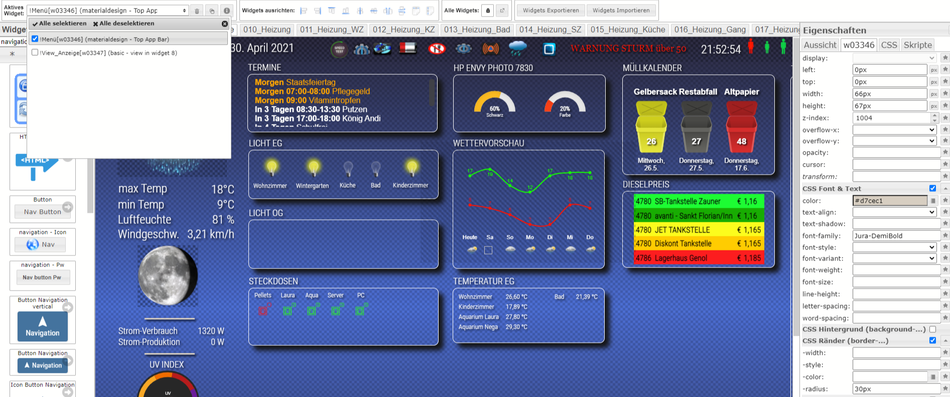
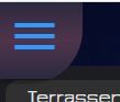
ich möchte die Farbe des "Hamburgers" (drei weisse, horizontale Linien"
 ändern. Habe ich die entsprechende Option in den Einstellungen übersehen oder geht dies nur mittels dem CSS Befehl
.mdc-top-app-bar .mdc-top-app-bar__navigation-icon {
    color: #ff0000;
}
Adapter: ioBroker.vis-materialdesign v0.5.6
Widget: materialdesign Widget - Top App Barhttps://github.com/Scrounger/ioBroker.vis-materialdesign/issues/171
-
ich möchte die Farbe des "Hamburgers" (drei weisse, horizontale Linien"
ändern. Habe ich die entsprechende Option in den Einstellungen übersehen oder geht dies nur mittels dem CSS Befehl.mdc-top-app-bar .mdc-top-app-bar__navigation-icon { color: #ff0000; }Adapter: ioBroker.vis-materialdesign v0.5.6
Widget: materialdesign Widget - Top App Barhttps://github.com/Scrounger/ioBroker.vis-materialdesign/issues/171
-
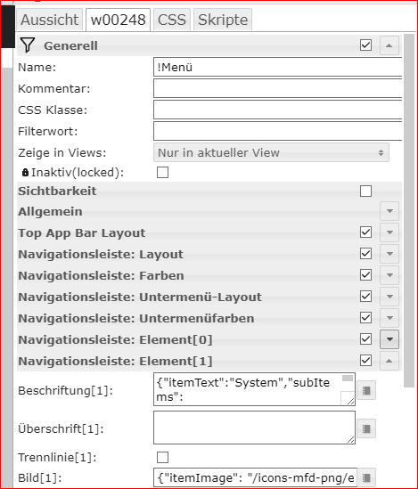
Hallo zusammen,
ich habe gestern angefangen das Design meiner VIS Link Text ein bisschen zu verbessern.
Als ersten Schritt woltte ich mir ein neues Menü bauen. Dazu habe ich das Widget "Top Add Bar Navigation Drawer" ausgewählt:
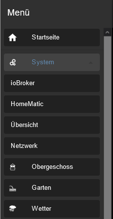
Jetzt stellt sich mir die Frage, ob sich die Menüpunkte (in meinem Beispiel "System") irgenwie wieder automatisch schließen lassen.
Aktuell werden die Unterpunkte nach dem Aufblättern immer angezeogt und müssen per erneutem klick wiede rzugeblättert werden.Des Weiteren frage ich mich, wie man jetzt die einezelnen Seiten über den FullyBrowser ansteuern kann, da ja alle Seiten per View in Widget 8 angezeigt werden sich bei mir dann der Seitenlink nicht ändert.
Im Moment übergebe ich bei Ereignis XY immer die Adresse der jeweiligen Seiten an mein Tablet per FullyKioskBrowser.
Hey! Du scheinst an dieser Unterhaltung interessiert zu sein, hast aber noch kein Konto.
Hast du es satt, bei jedem Besuch durch die gleichen Beiträge zu scrollen? Wenn du dich für ein Konto anmeldest, kommst du immer genau dorthin zurück, wo du zuvor warst, und kannst dich über neue Antworten benachrichtigen lassen (entweder per E-Mail oder Push-Benachrichtigung). Du kannst auch Lesezeichen speichern und Beiträge positiv bewerten, um anderen Community-Mitgliedern deine Wertschätzung zu zeigen.
Mit deinem Input könnte dieser Beitrag noch besser werden 💗
Registrieren AnmeldenSupport us
261
Online33.0k
Benutzer83.4k
Themen1.3m
Beiträge